If you’ve seen the science news headlines in the past few weeks, you may have noticed stories summarizing how 2011 ranked in climate history. What is interesting is that the headlines have been a bit contradictory. For example, if you’ve read the story as reported by the National Aeronautics and Space Administration (NASA), the headline reads “NASA finds 2011 ninth-warmest year on record”, which to me implies it was another record hot year given that it made the top ten list. Nonetheless, another story reported in ABS news touts that the world wasn’t quite as hot in 2011, coming in ranking only 11th in the history books. The latter report was based on findings by the National Oceanic and Atmospheric Administration (NOAA) and while the difference in rankings between the two reports is rather small, the sentiment conveyed by these headlines may lead readers to interpret these results as very different findings.
How could there be such a discrepancy in how two leading U.S. government agencies rank a given year in the climate record books?
Primarily, the difference is because each agency that monitors global temperature trends calculates global temperature differently. Choices on how to average the data and the source of data to use can easily yield different results. Basically, different methodologies can lead to different results. This is why it is so important for scientists – including GLOBE student scientists – to document exactly what methods they used in their research! However, as it turns out, both NASA and NOAA calculated exactly the same thing– that the global temperature in 2011 was 0.51°C (0.92°F) above the 20th century average – it’s just the way each ranked this 2011 statistic that was different.
How is the public supposed to make sense of these apparently contradictory findings?
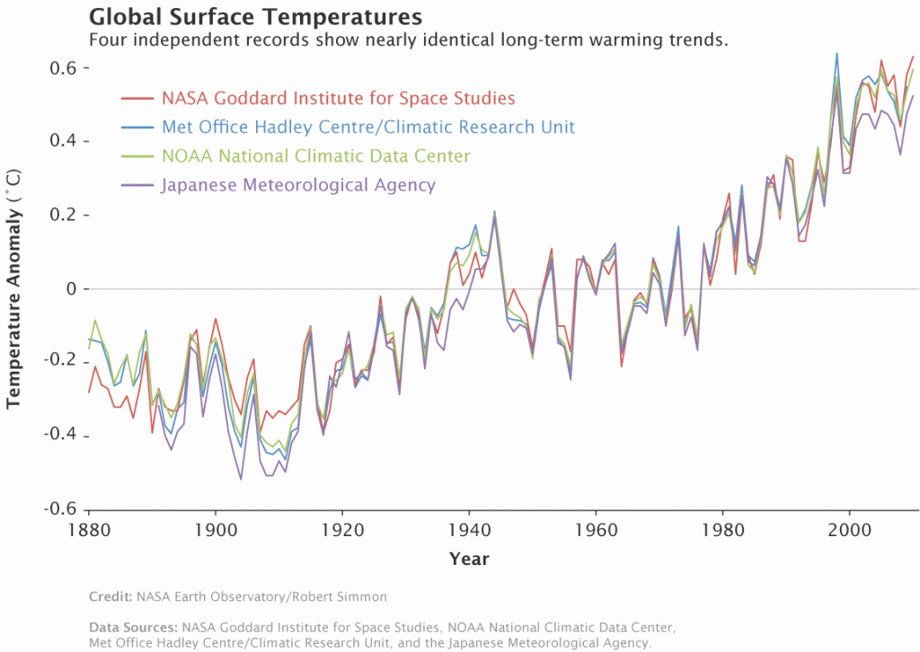
Given that the actual temperature anomaly for 2011 was exactly the same between the NOAA and NASA reports, it is less important to look at rankings. Rather it is key to pay attention to the overall trends in the data. Other international agencies that monitor global temperatures (such as the United Kingdom Hadley Centre and Japanese Meteorological Agency) also show similar overall trends. Regardless of how each agency ranks a particular year, all four records show peaks and valleys that fluctuate essentially in sync with each other since 1880 (see Figure 1). Furthermore, they all also show rapid warming in the last few decades, with the latest decade being the warmest on record.

Figure 1. Comparison time series of global surface temperature anomalies since 1880 from four agencies that monitor global temperature trends. (From http://www.giss.nasa.gov/research/news/20110113/)
What’s the moral to this story?
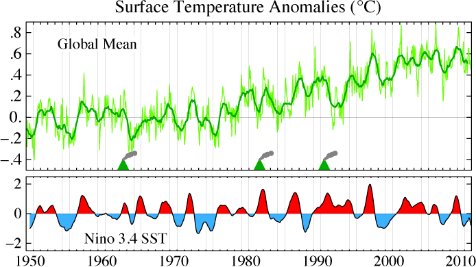
Despite how it is ranked, 2011 was yet another exceptionally warm year compared to the rest of the climate record since 1880. While it was not as hot as 2010 (which by many accounts tied for the world’s hottest year on record) likely due to cooling effects of La Nina (see Figure 2), the 2011 annual temperature anomaly was still similar to the warm anomalies of the last decade.

Figure 2. NASA Goddard Institute of Space Studies (GISS) surface temperature anomalies since 1950 shown as related to the El Nino Southern Oscillation (ENSO) index (bottom). The ENSO periods of La Nina (shaded in blue) and major volcanic eruptions correspond with cooling trends. (From http://data.giss.nasa.gov/gistemp/2011/)
Moreover, it is important as you read scientific studies, including science stories in the news, that you keep an open mind and explore all possibilities for how and why the results were determined. After all, as we have shown here, two different headlines could really be reporting the same thing!
GLOBE activity: Check out the “From Weather to Climate” activity to learn how weather data gets transformed into climate data and how there are different ways to make these calculations. Which is the correct method? There really isn’t one, but some methods may be more widely accepted than others, so it’s always good to do some research to see how other researchers have calculated climate data if you want to compare your findings with others!
-ST
