
Recently announced at the GLOBE Learning Expedition was the upcoming worldwide GLOBE Student Research Campaign on Climate Change, 2011-2013. This campaign will enhance climate change literacy, understanding and involvement in research for more than a million students around the globe. The GLOBE Program Office is encouraging students to contact the GPO with research ideas in areas such as water, oceans, energy, biomes, human health, food and climate. Please send your Climate Change Campaign research ideas to ClimateChangeCampaign@globe.gov.
With the upcoming GLOBE Student Research Campaign on Climate Change in mind, I thought it might be interesting to check for temperature trends in the data from GLOBE schools. (A preliminary version of the yearly-averaged GLOBE student data is included at the end of this blog.)
GLOBE was founded in 1995. By 1996, some schools were already recording temperature data regularly. This provides us with up to 12 years of data from some schools.
Figure 1 shows an example of a long record of monthly mean temperature.
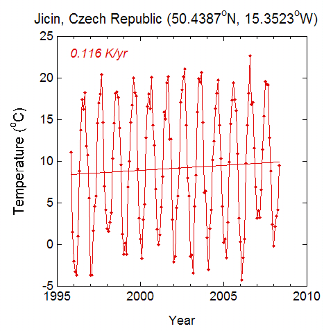
Figure 1. Monthly average temperatures from 4. Zakladni Skola in Jicin, the Czech Republic. The straight line through the data in a “best fit” linear trend determined by least-squares regression.
Figure 1 shows strong seasonal changes, with monthly average temperatures ranging from below freezing to around 20 degrees Celsius. While there is a long-term trend, the large departures from the trend line indicate that the estimate of warming rate is rather uncertain.
I decided to re-compute the trends by taking yearly averages. If a month was missing, I assigned a mean temperature equal to the average of the data from the two surrounding months (Fortunately, such gaps occurred in the spring or autumn, when filling in the data like this makes some sense). If too many months were missing, I didn’t include the year in the averages. Figure 2 shows the yearly-averaged data for 4. Zakladni Skola.
Note that the “best-fit” line in Figure 2 still shows a warming – but a different value. This is the result of the uncertainty in the linear trend, from a purely statistical point of view. This is not surprising – even the yearly averages don’t fit on a straight line. In fact the warmest year is 2000, near the beginning of the record.
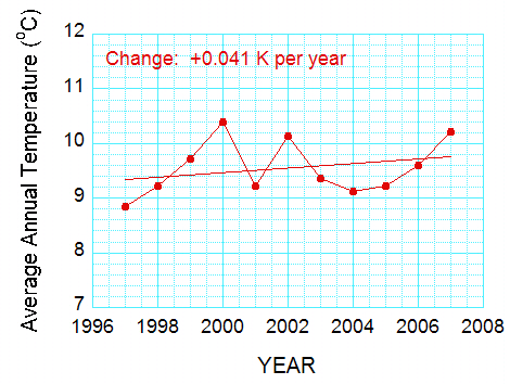
Figure 2. Average annual temperatures for the data in Figure 1. Note that the “best-fit” line still shows a warming, but a larger value.
We can reduce the uncertainty by adding more data. So I include data from five other schools in Europe in Figure 3.
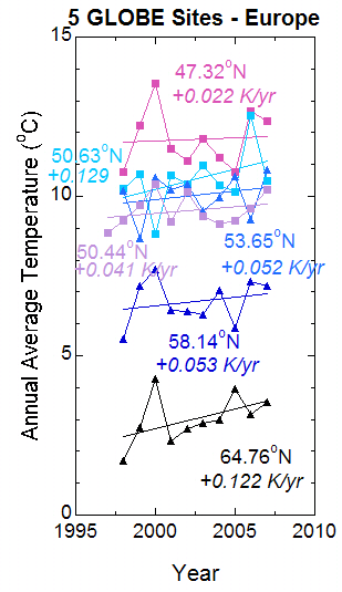
Figure 3. Temperature trends for six schools in Europe, selected so that no two schools are in the same country. Represented are Belgium, Estonia, Finland, Germany, and Hungary, as well as the Czech Republic.
In Figure 3, the best-fit trend lines for all six schools show warming. Note that the most rapid warming rates are at the farthest-north latitudes. Figure 3 gives us some confidence that Europe has been warming for the last decade, but there are year-to-year changes that are much larger than the 10-year trend. These short-term changes tell us there is a lot of uncertainty in the trend lines, but the fact that there are six lines instead of one gives us a little more confidence that the result might be “real” for the roughly 10 years data were collected.
For comparison, we take three sites in the United States, selected for having a continuous data record (Figure 4). In this case, two out of the three sites actually show cooling! This is quite different from Europe. However, as in the case of Europe, the year-to-year changes are greater than the long-term trend.
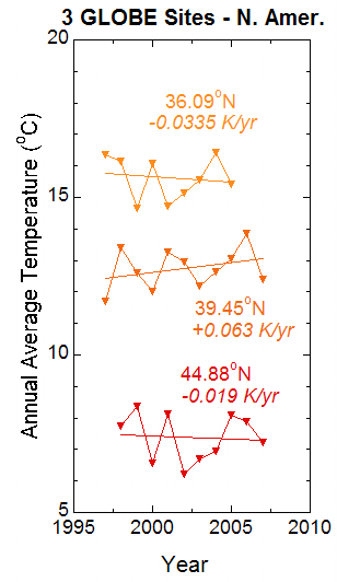
Figure 4. As for Figure 2, but for three schools in the United States.
Such differences could be real. The maps of temperature changes in Figure 5 show that the trends over 30 and 100 years show a lot of variation. For both time periods, the figure shows that Europe is getting warmer. Both periods also show more warming at higher northern latitudes. Results for the United States are mixed. Between 1905 and 2005, temperatures were warming over the northwest United States but cooling over the southeast United States. However, temperatures were warming over most of the United States between 1979 and 2005, with the possible exception of part of Maine (northeast corner of the United States).
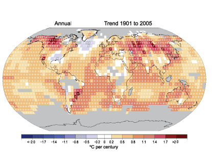
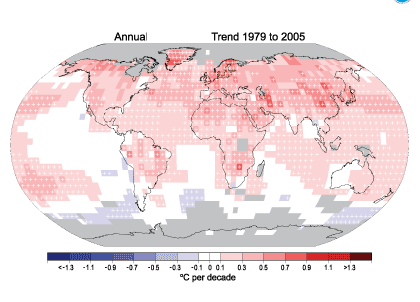
Figure 5. Linear trend of annual temperature for 1905-2005 (top) and 1979-2005 (bottom). Areas in gray don’t have enough data to get a good trend. The data were produced by the National Climate Data Center (NCDC) from Smith and Reynolds (2005, J. Climate, 2021-2036). This figure and an excellent commentary on recent climate change are found at www.ncdc.noaa.gov/oa/climate/globalwarming.html.
In this blog, I have avoided using statistics to estimate the uncertainty in the trends, but I think you can see two things. First, even with all this carefully-collected data, there is uncertainty in the local trends; but the uncertainty can be reduced by including more data in the same region. And second, the trends can be quite different in different parts of the world.
To close, I include two more plots. The first is a version of the well-known curve that shows Earth’s average temperature warming with time. I plotted the curve from data from the Climate Research Unit (CRU) of the Hadley Centre in the United Kingdom
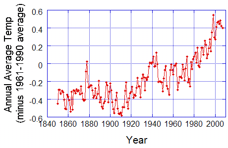
Figure 6. Annual average temperature, averaged over the globe. From the UK Hadley Centre (www.cru.uea.ac.uk/cru/data/temperature/hadcrut3gl.txt).
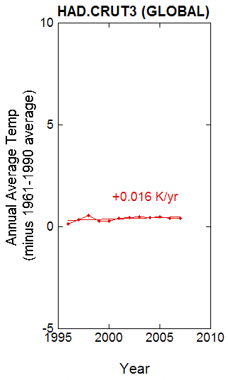
Figure 7. Data from Figure 6, with linear trend based on data from 1996-2007, on the same scale as for Figure 2 and 3.
The second plot is based on data since 1996 and plotted on the same scale as for the GLOBE schools. Notice how tiny the change is! This is, of course, because some parts of the Earth were cooling or warming less rapidly. But there is much more information included in that curve – and hence a lot more statistical certainty. Also, the scientists who worked on the data worked very hard to remove the effects of changing thermometers or station location, beginning and ending of observations, and many other things that can cause artificial trends. (By the way, a plot of the averages of the nine GLOBE sites produces a very slight warming with time of 0.0018 degrees Celsius per year – with the temperature peak in the year 2000 really standing out).
Clearly, this simple-looking curve took a lot of careful work to produce!
GLOBE STUDENT DATA
Below are the data used for Figures 1-4. For details in processing see the text.
| YEAR | 1 | 2 | 3 | 4 | 5 | 6 | 7 | 8 | 9 | 10 |
|---|---|---|---|---|---|---|---|---|---|---|
| 1997.0 | xxxx | xxxxx | 16.34 | xxxxx | xxxxx | 11.70 | xxxxx | 8.85 | xxxx | xxxx |
| 1998.0 | 7.73 | 1.69 | 16.15 | 10.75 | 10.23 | 13.40 | 10.17 | 9.23 | 5.51 | 9.43 |
| 1999.0 | 8.38 | 2.74 | 14.67 | 12.22 | 10.70 | 12.60 | 8.69 | 9.71 | 7.18 | 9.65 |
| 2000.0 | 6.57 | 4.28 | 16.09 | 13.55 | 8.830 | 12.00 | 10.60 | 10.40 | 7.72 | 10.00 |
| 2001.0 | 8.13 | 2.34 | 14.74 | 11.48 | 10.67 | 13.28 | 10.21 | 9.22 | 6.43 | 9.61 |
| 2002.0 | 6.21 | 2.72 | 15.15 | 11.11 | 10.40 | 12.96 | 10.37 | 10.13 | 6.38 | 9.49 |
| 2003.0 | 6.72 | 2.88 | 15.57 | 11.82 | 10.97 | 12.18 | 9.56 | 9.37 | 6.28 | 9.48 |
| 2004.0 | 6.95 | 2.98 | 16.42 | 11.23 | 10.35 | 12.65 | 9.95 | 9.13 | 7.05 | 9.63 |
| 2005.0 | 8.10 | 3.95 | 15.42 | 10.78 | 10.14 | 13.05 | 10.63 | 9.23 | 5.87 | 9.69 |
| 2006.0 | 7.90 | 3.16 | xxxxx | 12.66 | 12.54 | 13.87 | 9.28 | 9.61 | 7.34 | xxxx |
| 2007.0 | 7.24 | 3.55 | xxxxx | 12.35 | 10.48 | 12.40 | 10.83 | 10.22 | 7.19 | xxxx |
xxxx – missing data (see below)
Documentation of the data
Summary of Sites
GLOBE school locations
- Hartland, Maine, USA
- Utajarvi, Finland
- Tahlequah, Oklahoma, USA
- Karcaq, Hungary
- Eupen, Belgium
- Waynesboro, Pennsylvania, USA
- Hamburg, Germany
- Jicin, Czech Republic
- Tartumaa, Estonia
- Average of Temperatures 1-9
Yearly averaging
Missing months are “filled in” by averaging the surrounding months. This was done when one month was missing or two months was missing (very rare). Fortunately, the missing data tended to occur in the spring or autumn, when the missing temperatures would be expected to be between the temperatures of the neighboring months. The average was then computed by summing up the data for all 12 months and then dividing by 12.
Average of all nine sites
The average is found by summing up the temperatures in columns 1 through 9 and then dividing by 9. If a temperature is missing (as in the first row, 1996), an average is not computed. Why do you think we did it this way? Two out of the three sites (3 – Tahlequah and 6 – Waynesboro) are the two warmest of the nine, and the third (8 – Jicin) is in the middle of the temperature range. If we used the average of those three points, it would make the average temperature in 1996 too warm.
NOTE: The data here are reported to two decimal places, while some of the data used for the graphs has three or four decimal places, so results might vary slightly from the results shown here.
What can be done to “improve” the dataset? We will be calculating averages for other schools with long temperature records and adding them.