
I asked a climate scientist at NCAR, Caspar Ammann, to review the previous blog, and he brought up some interesting points that I thought I would talk about a little bit further. I am hoping this will inspire some of you to play with the data a little bit, in order to get a better “feel” for what makes the trends at the GLOBE sites “uncertain.”
The effect of extreme values on the trend line
Let’s start with the Jicin, Czech Republic, annual average temperatures. But this time, we will include 1996:
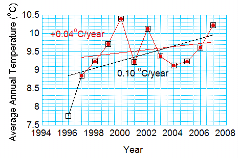
Figure 1. For GLOBE data at 4. Zakladni Skola in Jicin, the Czech Republic, change of trend from leaving out the first point.
In the figure the red points are those used for Fig. 2 of the previous blog. You see the trend, 0.04 degrees Celsius per year. If we add the point from 1996, the trend more than doubles – to 0.1 degrees Celsius per year – 1 degree Celsius per decade.
But 1996 might be a cold year. Remember – weather and climate vary from days to weeks to years to decades.
2001 was a cold year, too, relative to the surrounding points. What if we left 2001 out? How much would you expect 2001 to affect the trend? Note in Figure 2 that there is almost no effect. This is because 2001 is close to the middle of the data record. This makes sense: if you drew a straight line through the points by eye, you would be influenced more by the points at the beginning and end of the time series.
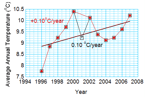
Figure 2. For same dataset, but ignoring the cold point in 2001.
Now, you might think that you should get rid of both years. Maybe they are not representative of the long term trend. Something happened in the Jicin area to make it a really cold year in 1996, and a really warm year in 2001. So, you plot the data without either of the two points.
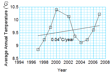
Figure 3. Same data as for Figures 1 and 2, but minus the averages for 1996 and 2001.
Now we are back to the trend in the first graph – 0.04 degrees Celsius per year!
Someone might look at Figure 3, and say that the average temperatures are just going up and down with time, like the seasons. And, that the trend is just because you didn’t have two (or three, or four) complete oscillations! You couldn’t really say this person isn’t right without having temperature measurements from before 1996.
Obviously, the actual value of the temperature trend depends on how you look at the data! You might try this exercise for other stations in the data provided in the last blog.
Let’s try this exercise for the global points in Figure 7 of the last blog:
Table: Global Annual Average Temperature minus the 1961-1990 Mean. Source, Climate Research Unit, Hadley Centre, UK.
| Year | Anomaly |
|---|---|
| 1996.0 | 0.13700 |
| 1997.0 | 0.35100 |
| 1998.0 | 0.54600 |
| 1999.0 | 0.29600 |
| 2000.0 | 0.27000 |
| 2001.0 | 0.40900 |
| 2002.0 | 0.46400 |
| 2003.0 | 0.47300 |
| 2004.0 | 0.44700 |
| 2005.0 | 0.48200 |
| 2006.0 | 0.42200 |
| 2007.0 | 0.40200 |
(The alert reader will notice that Figure 7 in the previous blog is slightly different now – I had accidentally included data for 2008, which is incomplete.)
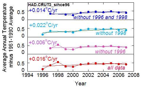
Figure 4. For the most recent 12 years of the Hadley Climate Research Unit data, the effect of ignoring “extreme” points in the time series.
Note from Figure 4 that the slope varies depending on the data selected, but that the trends remain positive.
Reducing the influence of extreme points by smoothing
Recall last time that I took out the seasons because I thought they might affect the trend. Climate scientists average in time to get rid of the effect of large year-to-year changes like the ones in 1996 and 2001.
To show the effect of smoothing the data for Jicin, I will do a “three-point running mean average.” This means that I will average the first three temperatures and the first three years. That is, I will average
7.7500
8.8500
9.2300 to get 8.61
And I will average the years, too
1996
1997
1998 to get 1997
Then I will average the next three temperatures for 1997, 1998, and 1999 to get the temperature for 1998, and so on. Let’s say how this smoothing affects the data
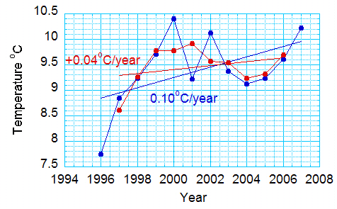
Figure 5. For Jicin data, change in trend from smoothing the data.
And you might want to try four-point averages or five-point averages. The fact that the trend is positive, no matter what we do, gives us a little more confidence that there is a warming trend. Just as adding more stations would. But no matter how good the data in Figure 4, this is a trend only for one place – and only for 12 years.
Defining the average temperature
Unlike trends, which are affected by where the numbers are in time, the year doesn’t matter when you take an average. The larger the number of points, the less difference an odd year makes. Let’s do the averages for Jicin, starting with 2 years, then three years, then four years, and so on, for the complete record, to see how each new year affects the average temperature. The results are in Figure 6
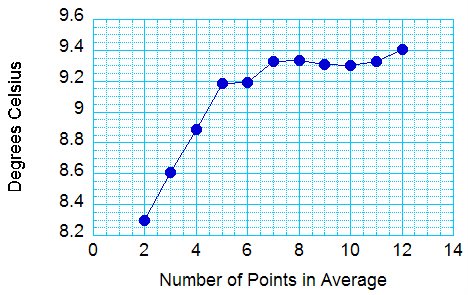
Figure 6. For the Jicin data set, the average as a function of the number of points. To take the average, we start by averaging 1996 and 1997 (two points), then 1996, 1997, and 1998 (3 points), and so on.
As you can see, even the large changes at the end don’t really show up much in the average. And I think you can also see that, the more points in the average, the less one difference one more point will make.
Climatologists have chosen to take their average over 30 years. Thus the HAD.CRUT3 curve in Figure 7 of the last blog is relative to a thirty-year average – from 1961 to 1990.