Currently, GLOBE is running a Workshop on “Global Climate Change Research and Education,” in Geneva, Switzerland, so this blog seems particularly timely. — PL
Hardly a day goes by that we don’t hear about climate change in the media or from your friends. Not everything we hear is accurate. In this blog and the next one, I will describe some misconceptions about climate change that I have recently heard, and then describe what the situation really is.
Scientists are replacing the term “global warming” with the term “global climate change” because the climate isn’t really getting warmer anymore.
It is true that many scientists don’t like the term “global warming.” This is because it implies that the temperature is getting warmer everywhere, which isn’t true. I’ve often heard the analogy to a fever, as in “the planet has a fever.” Unfortunately, this analogy implies not only that the planet is getting warmer everywhere, but that it is getting warmer everywhere at the same rate. If you have a fever, the temperature is higher by about the same amount throughout the body. So, no matter where you measure the body temperature – either on the forehead, under the tongue, in the ear, or elsewhere.
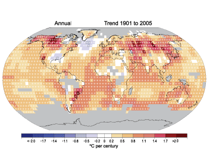
In contrast to the fevered human body, the Earth’s surface temperature is warming at different rates at different places, and some places are even getting cooler. Figure 2 shows the annual temperature trend of the yearly averaged temperature from the National Climate Data Center (NCDC), taken from the 11 June 2008 blog. You can see that the greatest warming is in northern North America and Eurasia.

Figure 1. Linear trend of annual average temperature for 1905-2005. The gray areas don’t have enough data to get a good trend. The data were gathered by the National Climate Data Center (NCDC) from Smith and Reynolds (2005, J. Climate, 2021-2036). The figure and an excellent commentary on recent climate change are found at http://www.ncdc.noaa.gov/oa/climate/globalwarming.html.
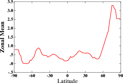
Figure 2 shows the surface temperature change relative to the 1951-1980 average, from the NASA Goddard Institute of Space Studies, averaged by latitude. Note that there are data here for higher latitudes, since different data sources are used. Also, the time period is different. You can see that the temperature is rising much faster at the high northern latitudes than at the equator.

Figure 2. Departure of 2008 surface (~top 1 mm) temperature from 1951-1980 average, averaged at each latitude. From NASA/GISS.
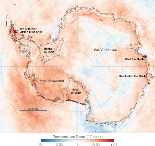
Just as in the middle latitudes in Figure 1, the surface temperature trends in Antarctica (Figure 3) are complex, with some areas even cooling according to this plot. (Note there is an article on Antarctic warming in the 22 January issue of Nature magazine.)

Figure 3. Image of surface temperature change in Antarctica between 1981 and 2007. These are based on infrared radiation from the surface (upper 1 mm), obtained using National Oceanographic and Atmospheric Administration satellites. Since the data come from more than one satellite, carefully comparisons to “calibrate” the data to make a reasonably uniform record. The very strong warming (darker reds) around the coast often reflects replacement of ice by open water. For further information, see http://earthobservatory.nasa.gov/IOTD/view.php?id=8239.
Going back to Figure 2, imagine now averaging the temperature trend over the entire earth. Since all the numbers are positive, the temperature trend averaged over the entire earth will also be positive. A global average is the “warming” we normally refer to when talking (or writing) about “global warming.”
However, the climate is changing in other ways as well. Perhaps you have heard about the fact that more heavy rain events are possible, or that the water vapor content in the atmosphere is increasing along with the temperature. This is another reason to prefer the term “climate change.”
