
Misconception: The carbon dioxide record at Mauna Loa is not reliable because Mauna Loa is a volcano.
It is true that volcanoes give off carbon dioxide. In fact, paleoclimatologists talk about “greenhouse worlds” with more carbon dioxide, much of which is thought to be from volcanoes. However, most of the time, the air at Mauna Loa is not influenced by volcanic gases released nearby. When air influenced by nearby volcanic gases is sampled, these data are not counted in the average. Similarly, at Cape Point, South Africa, which we visited during the GLOBE Learning Expedition, scientists try to avoid using data influenced by nearby Cape Town (see 11 Aug 2008 blog).
To see what the carbon dioxide trends are in different parts of the world, I went to the NOAA Earth System Research Laboratory Web Site). Here, you will find data from stations around the world. These measurements are taken at about 30 m above the surface. Figure 4 shows an example.
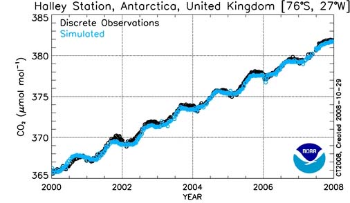
Figure 4. CO2 time series for Halley Station, Antarctica. From NOAA ESRL site (see text). The observations are the black points. The turquoise points are from the “Carbon-Tracker” model. USE graph without gap.
Just for fun, I looked at 15 such plots, and drew a line by eye (“faired” the line) to find the trend in carbon dioxide concentrations using the end points at the beginning (1 January 2000) and end (31 December 2008). Figure 5 shows what I did for the plot in Figure 4.
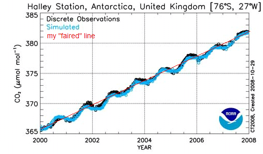
Figure 5. Figure 4 with the straight line I drew through the data (I tried to follow the black points, which are the observations). The values I read off are at the ends of the line, i.e., at the beginning of 2000 and the end of 2008.
Then I put the numbers in a table, and took the differences for each day. Figure 6 is a plot of the values at the beginning and end of the period for the 13 stations that didn’t have too much scatter. (The other two, in Europe, had considerable scatter, and higher rates of increase – around 2.6-2.7 parts per million (PPM) per year).
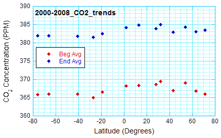
Figure 6. End points of the straight line drawn by eye through curves like that in Figure 3. Data from NOAA Earth System Research Laboratory/Global Monitoring Division.
It is interesting to see that the highest carbon-dioxide concentrations occur in the northern middle latitudes, where the most people (and cities, and factories, and cars) are. Even so, the carbon dioxide concentrations at the beginning and end of the period change little with latitude. Finally, the changes with time (over eight years) are about the same at all locations plotted. If we average the yearly trends, we find a carbon-dioxide increase of 2 PPM per year, with very little scatter (standard deviation 0.08 PPM per year, standard error 0.022 PPM per year).
Misconception: The warming pattern is related to the pattern of carbon dioxide concentration. Where carbon dioxide increases faster, the temperature is warming faster.
It is true the carbon dioxide has “weather.” Carbon dioxide concentrations near the surface can vary a lot (several tens of parts per million) from day to night, and from summer to winter at a given location (see 7 September 2007 blog) . Carbon dioxide concentrations tend to higher over more populated regions, as illustrated by Figure 7, with lower values over the ocean.
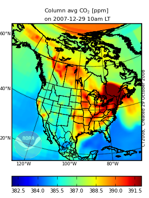
Figure 7. “Carbon-Tracker” model-based Carbon dioxide “weather” over North America based. The concentrations are the averages for a column of air. From http://www.esrl.noaa.gov/gmd/ccgg/carbontracker/co2weather.php.
However, as shown in Figure 6, the long-term trends in carbon dioxide don’t vary that much.
What then explains why some areas are warming more than others? Let’s start by thinking about what changes the temperature on a daily basis.
It is true that the “greenhouse” effect of both carbon dioxide and water vapor (which varies quite a bit) has an effect on temperature change through radiative processes. In fact, the water vapor content changes a lot more than the carbon dioxide content. Something closely related to “average column carbon dioxide content” is the “precipitable water,” or the amount of water vapor in a column, that, if condensed, would fall at the surface beneath that column. One can find examples of precipitable-water maps on the web. For example, visit http://weather.unisys.com/upper_air/ua_con_prec.html. You will find that precipitable water over the United States varies by a factor of five, ten, or more!
However, temperature changes near the surface are mostly driven by heating (or cooling) of the ground, and the ground in turn heating (or cooling) the air. Of course radiation plays an important part here, too. During the day, when the ground is heated, the heating is especially effective, since air warmed by the ground is buoyant. This buoyant air rises, carrying heat upward with it. Clouds also affect temperature change. Cloudy days are often cooler than days with clear skies, because less sunlight reaches the ground. Clouds at night “trap” heat near the ground, keeping the air from cooling off as much. The wind can bring in warmer air from the south and colder air from the north (in the Northern Hemisphere). And rain showers and thunderstorms also affect temperature.
(When you average over the whole Earth, many of these effects cancel – you are bringing heat to one area but taking it away from another. But, from the point of view of Earth versus space, only the radiative effects matter – those related to the mixture of gases in the atmosphere, and also aerosols and clouds. The other methods of heat transfer – conduction and convection, don’t work in the near-vacuum of space.)
The changes described above are rapid day-to-day changes – what we call weather. And the real question is why are some areas warming faster than others over decades? There are several reasons, depending on the part of the world we are thinking about. All of these are still areas of active research.
1. The warming of the high northern latitudes (Figure 1) is related to the reduction of time when the surface is covered by ice or snow. The warming of the high northern latitudes is often thought of as an example of a positive feedback loop: the more ice melts, the less sunlight is reflected away, which leads to more warming, which leads to more ice melting, and so on.
2. Uneven warming of the Earth causes a shift in the jet stream and storm track, which can influence temperature and rainfall. The best example of this is the highs and lows associated with continents and oceans in every introductory meteorology book. This influence of oceans versus continents is of course permanent except on geologic time scales.
But, in the last few decades, scientists have discovered that variations in the sea surface temperature over a few years influence where thunderstorms occur over the Pacific Ocean. The shift in the stormy areas influences the track of the jet stream, and hence weather downstream. Thus, for example, some locations in North America will have a greater chance of northerly winds aloft in some years, and thus have colder weather than when the northerly winds weren’t there.
Changes in the normal wind direction on the seacoasts influence whether or not there is upwelling, or water rising from lower levels. The water rising to the surface tends to be cooler, which cools the air temperatures over the adjacent land.
3. Scientists think that the loss of ozone over Antarctica has kept the temperatures at the South Pole from warming (See Figure 2). (may add two references here)
4. Changes in land use could be influencing the temperature trend in parts of the world. For example, an increase in green plants could lead to more sunlight being used for evapotranspiration and increasing the water vapor in the air at the expense of increasing the temperature. Another example is the warming produced in cities, not only be replacing vegetation with concrete (which heats up more readily when it’s dry), but also by the energy release associated with manufacturing, heating and cooling buildings, transport, and even human metabolism (see 7 Feb 2007 blog).
A post-script. The 16 January Science announces the impending launch of two new satellites, Japan’s GOSAT (Greenhouse Gases Observing Satellite) and US/NASA’s OCO (Orbiting carbon observatory). The GOSAT will be able to look at the relationship between carbon dioxide and weather patterns, while OCO will focus on carbon-dioxide patterns over longer times (a few weeks and longer).