Land Use: How Important for Climate?

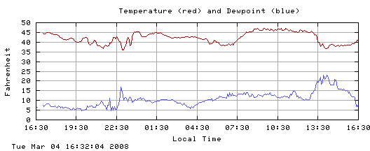
According to the most recent report by the Intergovernmental Panel on Climate Change, land use change has a relatively minor impact on the recent rise in global average temperature.

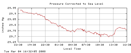
Yet, as stressed in an earlier set of blogs on Iowa Dew Points and an apparent increase in stormy activity regionally, land use seems to be quite important at local and even regional scales.

Why the difference?

According to an article by Raddatz in a recent issue of Agricultural and Forest Meteorology, about 3.6% of Earth’s surface is covered in crops, and about 6.6% is in pasture. Figures 1 and 2 show what these percentages look like. Even if all the temperature trends associated with changes in land cover were all in the same direction, it would require large changes indeed to show up significantly in the average global temperature for a whole year.

fraction14.gif

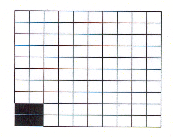
Figure 1. Fraction of Earth’s surface covered with crops, rounded up to 4%.

fraction27.gif

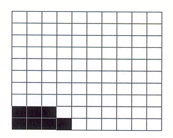
Figure 2. Fraction of Earth’s surface covered with pasture, rounded up to 7%.

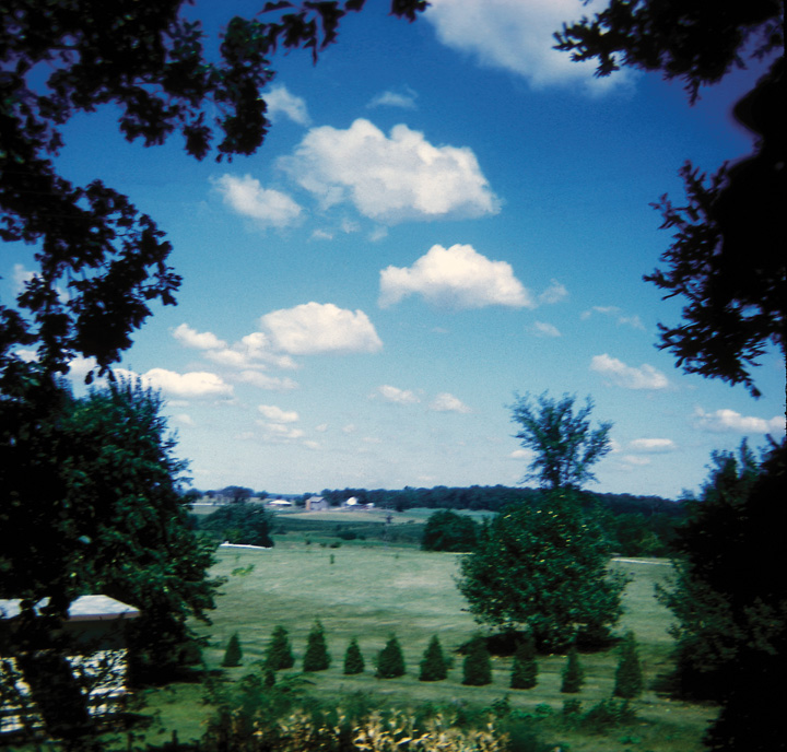
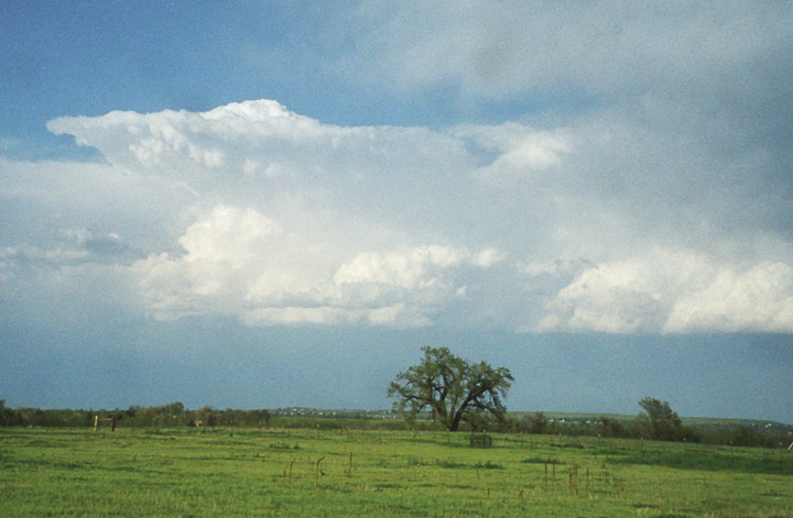
Further, crops grow actively only part of the year. So, for example, winter wheat or corn will lead to cooler maximum temperatures during their growing season. (Recall this is because more of the sun’s energy hitting the surface is going into evapotranspiration and less into heating). During the rest of the year, the stubble or plowed ground would have a different effect from surrounding green vegetation. In fact, the dormant fields could be warmer than grasslands if the grasses are green. Thus it is not surprising that converting natural land cover to crops or pasture does not always have the same effect on temperature change. In some areas, there is a cooling effect (e.g., if more moisture is being evaporated or transpired, or if more sunlight is reflected), while in other areas, there is a warming effect (e.g., more sunlight absorbed, less evaporation or transpiration). And finally, as pointed out in the Iowa Dew Points blogs, regional changes in land cover could have an indirect effect, like shifting the wind patterns. This can in some cases decrease the local influence on temperature. Figure 3 illustrates the “mixed” effect of crops.

fraction1color.gif

Figure 3. Possible scenario showing effects of crops on the global average temperature, with the “red” representing a net warming effect over the whole year, and the “blue” representing a net cooling effect. This is only to illustrate that the net effect of crops will be mixed, rather than saying what the effect will be.

As noted in earlier blogs, cities also affect the temperatures, but they occupy a tiny fraction of Earth’s surface.

This does not mean that land use isn’t important. We live on land, which occupies only 30% of the globe. If we change our percentages of Earth’s surface to percentages of Earth’s land surface, they become bigger – 3.6% of Earth’s surface becomes 12% of Earth’s land surface, and 6.6% of Earth’s surface becomes 22% of Earth’s land surface! Furthermore, we humans aren’t evenly distributed: there are vast parts of Earth that are uninhabited. Human influence on land cover is where humans are. And, of course, those seasonal effects on temperature are important to us if they are happening where we live.

fraction3_12.gif

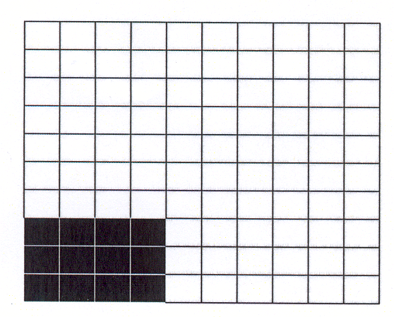
Figure 4. Fraction (12/100) of land surface on Earth covered with crops.

fraction4_22.gif

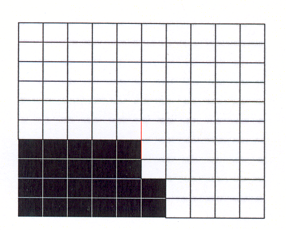
Figure 5. Fraction (22/100) of land surface on Earth covered with pasture.

Climate researchers know this. You have mainly heard about the predicted average annual temperature because it is the easiest “measure” that sums up all the details in one convenient number. This is particularly helpful in sending the message to governments, businesses, and individuals that Earth is getting warmer. Once you think about how this will affect how you live, one temperature is clearly not enough. You want to know how the temperature varies seasonally and where you live.

Also, climate models cover both a large area (the whole Earth) and a long time (decades), so they are expensive to run and require the biggest computers. And, they have to account for the various things that affect climate from the outside – the variability in the sun, the variation in greenhouse gases and particles, etc. By comparison, weather models are run for at most around 10 days or so. To make the runs doable, climate models work on points too far apart to really represent smaller-scale atmospheric motions (“weather”), smaller-scale regional effects (such as vegetation changes), and even terrain.

Some climate scientists have looked at regional climate changes by running weather-type (regional) models to describe what’s happening at the boundaries of a smaller area – such as the United States. (If the model only covers the United States, it still has to account for what the wind brings from the outside!) These models have taught us something. However, there is a worry that the climate models supplying the boundary information are themselves faulty because the effects of “weather” could affect the details of the local wind, temperature, etc.

So, in spite of the enormous costs, climate scientists are just now starting to run climate models on computers or clusters of computers working together that are powerful enough that global climate models can represent these regional changes better. The first such computer system was the Japanese Earth Simulator. It enabled model runs with grid points spaced at one-tenth the distance of most climate models. As more and more people start focusing on regional climate, and more computers with the capability of the Earth Simulator become available, the issues of our effect on Earth’s surface will be studied more intensely.

And our discussion didn’t even consider more long-term effects, such as the effect of land use on changes in greenhouse gas concentrations! Nor have we considered the effects of forests.

Reference: Raddatz, R.L., 2006. Evidence for the influence of agriculture on weather and climate through the transformation and management of vegetation: Illustrated by examples from the Canadian Prairies. Agricultural and Forest Meteorology, 142, 186-202.

Posted in Climate, Climate Change, Land Cover | Leave a comment

Will there be more tropical cyclones in the future?

At a recent meeting, someone commented to me that the “global-warming folks” must be wrong, since we haven’t had a strong hurricane season since 2005, and weren’t they saying that a warmer climate means more hurricanes?

Since we had work to do, I let the comment go, but decided later it would be a good subject for a blog. Particularly since the “official” hurricane season starts on 1 June in the United States.

In 2005, a couple of papers (see references with asterisks, below) came out that implied that there could be more strong tropical cyclones in a warmer climate. (“Tropical cyclone” is the more general term for such storms; “hurricanes” are tropical cyclones that affect North and Central America and the Eastern Pacific north of the Equator.) These papers were well-timed, because 2005 was a devastating North Atlantic hurricane season, with four – Emily, Katrina, Rita, and Wilma, reaching Category 5 on the Saffir-Simpson scale (sustained winds of 155 miles per hour (135 knots or 249 kilometers per hour – henceforth km/hr). Katrina was the most devastating hurricane in memory, with a death toll (well over 1000) exceeded only by the “1900 storm” that destroyed Galveston, Texas and killed between 6000 and 12,000 people. Hurricane Wilma had the lowest central pressure (882 millibars) of any recorded Atlantic hurricane, with sustained winds of 175 miles per hour or 292 km/hr. (The strongest tropical cyclone was Typhoon Tip, whose central pressure dipped to 870 millibars with sustained winds of 190 mph (305 km/hour) on 12 October 1979).

namedstorms-majorhurr-t.gif

Figure 1. Number of named tropical storms (blue) and named hurricanes (red) by year. From the U.S. National Climatic Data Center.

Finally, 2005 was the year they ran out of names and had to start using Greek letters to name hurricanes, with Zeta, the 26th and last storm, occurring between 30 December 2005 and 6 January 2006. (For the North Atlantic list, names starting with Q, U, X, Y, and Z are left out; the remaining hurricanes were named for the first five letters of the Greek alphabet).

The arguments used for strong hurricanes in a warming climate related to the warming of the sea-surface temperature. Basically, a hurricane is like a heat engine, getting its energy primarily from water vapor evaporating from the warm sea surface, and cooling off at cloud top, around 15 kilometers above the surface.

globalsst.JPG

Figure 2. Globally-averaged sea-surface temperature anomaly (sea surface temperature minus mean for 1961-1990). Data from Climate Research Unit, Hadley Centre, UK. (http://www.cru.uea.ac.uk/cru/data/temperature/)

Although there is variation from region to region, the global average of carefully-compiled sea surface temperatures (Figure 2) does indicate a warming. The warming is due to more greenhouse gases in the atmosphere. These gases trap heat in Earth’s lower atmosphere, land surface, and ocean.

However, there are changes superimposed on this long-term trend. In the North Atlantic, these changes can take several decades. The relatively few strong hurricanes during the 1970s and 1980s follow more strong hurricanes in the 1950s and 1960s so this “natural variability” is important as well. One familiar example of natural variability is El Nino, which spreads warm surface waters eastward across the Equatorial Pacific Ocean and affects wind and weather patterns over much of the earth. As noted in previous blogs, aerosols and solar variability can also affect temperature changes on earth, but the effect of the sun is probably fairly minor over the last several decades.

Other things being equal, warmer sea surface temperatures would mean stronger hurricanes. However, other things are not equal. Certain wind patterns favor hurricane development, while other wind patterns do not. For example:

  • Converging winds (more air flowing horizontally into an area than leaving) favor hurricanes. Hurricanes are storms with air near the surface spiraling in to the center, until it reaches the eye wall, where it spirals upward and slightly outward. Such motions are favored in regions where the air is slowly moving upward. This happens where winds converge into an area.

  • Little wind change (called wind shear) with height favors hurricanes. If the wind changes enough with height, it can disrupt the air circulation in a developing tropical storm, keeping it from developing into a hurricane.

  • Wind patterns are much harder to predict in climate models. For example, researchers have found that fewer hurricanes occur during El Nino years. This is because El Nino warms the eastern equatorial Pacific, and this leads to wind shear over the Atlantic basin. But it is not clear how the warming climate will affect the occurrence of El Ninos. If there are more in the future – this effect could offset that of the generally warming sea surface temperatures. Indeed, a new paper by Knutson and colleagues has just pointed out such a possibility. However, it is interesting to note their caution and list of caveats (mostly that the input to their modeling studies is based on global climate models that are still not adequate at regional scales).

What about 2008? On 22 May, the U.S. Climate Prediction Center issued a “2008 Hurricane Outlook” that called for a “90% probability of a near-normal or above-normal hurricane season” in the United States, with the above-normal season more likely (65% chance). Among the factors considered was La Nina (the “cold” phase of El Nino).

As for the rest of the world, the northern hemisphere has already experienced one of the most deadly tropical cyclones in recent history, Cyclone Nargis, which devastated parts of Myanmar and killed tens of thousands of people.

For the longer-term future, the warmer oceans should lead to stronger tropical cyclones – when the wind conditions favor their formation and growth. The real question is how often the favorable wind conditions will happen.

References

*Emanuel, K. 2005: Increasing destructiveness of tropical cyclones over the last 30 years. Nature, 436, 686-688.

Knutson, T.R., et al., 2008: Simulated reduction in Atlantic hurricane frequency under twenty-first century warming conditions. Nature Geoscience, doi:10.1038/ngeo202.

*Webster, P.J., G.J. Holland, J.A. Curry, and H.-R. Chang, 2005: Changes in Tropical Cyclone Number, Duration, and Intensity in a warming environment. Science, 309, 1844-1846.

Hurricane Statistics from
NCDC: Climate of 2005: Atlantic Hurricane Season Summary.

http://www.ncdc.noaa.gov/oa/climate/research/2005/hurricanes05.htlm

Acknowledgments: I wish to acknowledge Caspar Ammann of NCAR for checking this blog and pointing out the Knutson reference.

Posted in Atmosphere, Climate Change | Leave a comment

“Fropas”

One of the most exciting weather phenomena is the passage of a front, called a “Fropas” (FROH-pah) by meteorologists. Especially a strong cold front. A front is simply the boundary between a large mass of cold air and a large mass of warm air. When the cold air mass is moving in to replace the warm air, the front is called a “cold front.” Norwegian meteorologists used the name “front” to describe this boundary because the turbulent weather that occurs there reminded them of the battle fronts in World War I. One really nice thing about fronts is that you can often see them from space, and from radars. You can also see how the cloud patterns change as the front passes. I show some examples below for some fronts that passed through Boulder this spring.

From a satellite, cold fronts are sometimes quite easy to identify at least roughly. Here is the satellite image of a front that passed through Boulder on 12 May 2008. The image is centered on Colorado. The arc-shaped group of clouds, open to the northeast, marks the front.

fropasmay1208g1220081332202_smden_vis.jpg

Figure 1. Satellite image close to time that a cold front passed through Boulder, Colorado, at 2202 UTC (16:02 or 4:02 p.m. Local Daylight Time) 12 May 2008, from http://www.rap.ucar.edu/weather/satellite/. The arc of clouds over northeastern Colorado marks the leading edge of the front. Colorado is the rectangular-shaped state in the middle of the figure. The northwest-southeast band that covers much of the northwest part of the image is related to the larger-scale pressure pattern higher up.

Note that all the charts and images (except for the cloud pictures) are from the UCAR weather page.

You can also see the arc of clouds in the center of Figure 2 (light bluish-green echoes). This means that the clouds contain some rain-sized particles. Behind (northeast) of the front, the weak signal is probably from insects. The blue-and-green echoes at the top of the radar image represent an area of precipitation.

20080512_215822_black.png

Figure 2. Radar image for 21:58 UTC (15:58 or 3:58 p.m. Local Daylight Time) showing the clouds (greenish-blue arc open to the northeast) corresponding to the cold front. The thick straight white lines show the north and east borders of Colorado; the circle is centered at the radar, at a distance of 150 km (slightly less than 100 miles). The thin white lines are the boundaries of the counties. From http://www.rap.ucar.edu/weather/radar/

2008051300_metars_den.gif

Figure 3. Surface data at 00:45 UTC 13 May (18:45 or 6:45 p.m. Local Daylight Time 12 May). The circles (or squares) lie on the observation locations; the line from the circle/square points to the direction from which the wind is blowing; the number of barbs on the line gives the wind speed. Each full barb represents about 5 meters per second (10 knots), so two barbs mean about 10 meters per second, and three barbs mean about 15 meters per second. The front in this figure is slightly to the south of where it was in Figures 1 and 2. From

http://www.rap.ucar.edu/weather/surface/.

Figure 3 shows the wind direction and temperature changes across the front. Notice how the wind changes abruptly in eastern Colorado. In northeast Colorado, the winds are out of the northeast or the north-northeast, at around 20-30 knots (10-15 meters per second). In southeastern Colorado (ahead of the front), the winds are out of the southwest at 15 to 25 knots (7-12 meters per second). The temperatures (red numbers, Fahrenheit degrees) are warmer south of the front, where the wind is out of the southwest. (Note: we are just considering the airflow east of the mountains, which go north-south across the center of Colorado).

What does the front look like from a point?

When the front passed Boulder, the wind changed from west-southwest (270 to 225 degrees) to northeast (around 45 degrees, Figure 4). From both this figure and the map showing the winds, we see that the winds are coming together at the location of the arc. This means that the air has to go up at the arc. In fact, the warmer, lighter air flows up over the heavier, cold air. As the air rises, it cools, and water starts to condense, forming the clouds we see in the radar and satellite images.

fropasmay1208ddcgi.png

Figure 4. Wind direction at NCAR Foothills Laboratory, Boulder, Colorado, USA. Note the direction change between 13:15 and 16:15 (1:15 p.m and 4:14 p.m.) Local Daylight Time (Add six hours to get Universal Coordinated Time, or UTC). (270 degrees = west wind; 0 or 360 degrees = north wind, 90 degrees = east wind, 180 degrees = south wind). To get UTC, add 6 hours to Local Daylight Time. From
http://www.rap.ucar.edu/weather; click on “Foothills” under “current conditions” on the right hand side of the page.

fropasmay1208ffcgi.png

Figure 5. As for Figure 4, but for wind speed. Note the winds reached 20 miles per hour (~ 20 knots or 10 meters per second) and stronger near the front.

Once the wind shifted to northeast, it was bringing with it cooler air from the north, as shown in Figure 6. Notice that the cool air also has a higher dew point.

fropasmay1208ttd.png

Figure 6. As for Figure 4, but for temperature (red) and dew point (blue). Note the sudden temperature drop at the same time the wind changes.

Have you heard the rule, “Air tends to move from high to low pressure.”? Figure 7 shows that air pressure was lowest around the time the front passed. So a map showing pressure would show the lowest pressures at or near the front’s (cloud arc’s) location.

fropasmay1208pcgi.png

Figure 7. As in Figure 4, but for air pressure. Note the lowest pressure comes just before the sudden jump in temperature and dew point, and the sudden shift in wind direction. There are about 33.86 inches in one millibars (hectopascals).

I did not photograph the clouds on this day, but did for another frontal passage. The charts, shown below in Figure 8, show similar patterns to the three from the frontal passage on 12 May 2008, except that the winds behind the front were from the northwest (around 315 degrees).

fropas4mar1340ddflcgi.png

fropas4mar1340ttdflcgi.png

fropas4mar1340pflcgi.png

Figure 8. As in Figure 4, but for wind direction, temperature, and pressure, for frontal passage around 13:30 local time 4 March 2008, at NCAR Foothills Laboratory in Boulder, Colorado, USA. To get UTC, add 7 hours to local time (Local Standard Time).

Here are the clouds with this front. Note that the structure changed from spring-like fair-weather cumulus, to more wintry clouds, with some snow falling nearer the mountains.

south.JPG

Figure 9. Looking south. Note the cumulus clouds to the south, and the less distinct clouds overhead at this time.

lookingeasredited.JPG

Figure 10. Looking east. Notice the change in structure from the right (southeast) to the left (northeast).

lookingnwedited.JPG

Figure 11. Looking northwest. Light snow is probably falling from the clouds.

When you see a front pass near your location, go to one of the satellite web sites mentioned in the 9 May 2008 blog, “Watching Clouds,” to see if the front can be seen from space. Or, if you are in one of the contiguous United States, you can go to http://www.rap.ucar.edu/weather, select “satellite” and click on your part of the country. You can also access the temperature maps (select “surface”) and radars (select “radar”) at this site.

Posted in Atmosphere, Backyard Science, GLOBE Protocols | Leave a comment

Wind Power

The cost of using fossil fuels has gone up – we paid over $4.00 a gallon for gasoline for the first time this weekend. But of course there is the no-longer-hidden cost of what the carbon dioxide and other greenhouse gases released to the air when the fuel is burned do to our climate.

gas_signs.jpg

Figure 1. Watching the gas prices get higher than the milk prices. (Left) 5 March 2008; (Right) 15 May 2008. The four-dollar gasoline was purchased in Nebraska.

People are starting to respond sensibly, if slowly, by developing more efficient ways to extract power from fossil fuels or other sources in our environment. There is talk of cleaner coal and gas power plants, and making hydropower more efficient. Nuclear power is being considered more seriously. And we are developing new ways to get the energy we need. Among these are biofuels (for transportation), solar power, power from tides, geothermal, and wind power.

This weekend, I had the opportunity to drive through a large wind farm in northeastern Colorado, whose location you can find from the maps below.

maps.gif

Figure 2. (Left) location of Colorado. (Right) Location of Peetz.

The “wind farm,” near Peetz, Colorado, can generate up to 400 megawatts of energy. This makes the Peetz wind farm the second largest in the United States at this time. 400 megawatts is sufficient to power 120,000 homes in the U.S. There are 267 wind turbines, which cover an area that stretches for miles. It was fun to find out that oil is being pumped from the same land (Figure 3). Germany produces the most wind energy on Earth, with the U.S. second. According to the Global Wind Energy Council, wind power grew an average of 28% per year in the decade ending in 2006.

Theoretically, wind can be used to meet much of the world’s energy needs. But what of the negative side?

Many are worried about wind turbines killing birds. Current estimates of bird deaths from turbines run into the tens of thousands (U.S. statistics). To put this into perspective, many more birds are killed by collisions with automobiles, transmission towers, power lines, and windows. Such statistics aside, the danger to breeding populations, particularly of bird species that are no longer abundant, needs to be understood and considered.

But there are additional concerns. How do wind turbines themselves affect the weather and climate? Believe it or not, people are actually thinking about this. Also, the wind doesn’t blow all the time, so either a method is needed to “store” the energy, or we would have to use energy from another source when the wind isn’t blowing. Also, some people think that wind turbines are ugly (though others think they are beautiful).

Would you want a wind farm in the countryside or sea shore near you?

One more thing to think about. While higher energy prices make it harder for us to pay our bills for electricity, heating, and gasoline; high prices for energy also mean that industry will be more willing to develop new ways of extracting energy. Or, industry may be more willing to invest in figuring out ways to make conventional sources of energy more efficient. And higher energy prices make us more interested in using energy more efficiently by taking simple steps like turning out lights when we are not in the room, wearing a sweater and keeping the inside temperature cooler in the winter, and walking or taking the bus instead of driving.

windmill4cropped.jpg

Figure 3. A new and growing source of power – wind turbines, surrounding an oil pump (“pump jack”), representing a more traditional source of power. Near Peetz, Colorado, U.S.A.

Posted in Atmosphere, Carbon, Earth as a System | Leave a comment

Watching Clouds

In the last blog, I looked down – at a puddle. But most of the time, I look up: to see what birds are overhead, and to watch clouds.

fig20.jpg

Figure 1. Picture of fair-weather cumulus clouds east of Beloit, Wisconsin, USA.

Have you ever wondered how big a cloud is? Or how much it weighs? Or how long it lasts?

I’ve often thought about these questions, and it is actually fairly simple to get some “typical” answers.

How big is a cloud? What is its height? Width? Volume?

There are a several ways to get an idea how “big” clouds are.

You can look at clouds in a satellite image of your area, and “scale” the clouds to the size of the state or country you live in. This works best for larger clouds like thunderstorm clouds, or sheets of stratocumulus or altocumulus that stretch across the sky. Some sites for accessing satellite pictures are:

When you are in an airplane or on a mountainside or tall building, you can look at the shads of the clouds on the ground. In the Midwestern United States, the land is divided into one-mile (1.6-kilometer) sections; with roads often marking the sides of the section, so that the land looks like graph paper. By comparing the size of the shadow to the mile-square sections, you can see how big the cloud is.

When you are in airplane (or a car, bus, or train), you can time how long it takes to pass through a cloud or its shadow. For the airplane, you need to know how fast it is traveling with respect to the air.

  • For a jet airplane at cruising altitude, 550 miles per hour or 250 meters per second is a good first guess. So, if it takes 10 seconds to pass through a cloud, the cloud is 2.5 kilometers wide.
  • For a car, you need to assume that the cloud isn’t traveling very fast, since clouds can travel as fast as cars. If you are traveling at 70 miles per hour (about 35 meters per second) beneath a cloud that is not moving, and it takes 10 seconds to go through the its shadow, the cloud is 350 meters across. If the cloud is traveling with the car, you might overestimate the cloud’s width. (If the cloud travels as fast as you are traveling in the same direction as the car, you will stay in shadow as long as the cloud exists). Things get more complicated if the cloud moves across your path. Also, late in the afternoon, cloud shadow size increases with the depth as well as the width of the cloud. But remember, we’re only trying to get a rough idea of cloud size.

How much does a cloud weigh?

I include only the water in the cloud – not the air. Think about a “typical” cumulus cloud, about a kilometer on a side.

The volume of this cumulus cloud is:

1000 meters times 1000 meters .times 1000 meters, or 1,000,000,000 cubic meters

Measurements from aircraft flying through cumulus clouds suggest a cubic meter contains about 0.5 grams of water – that’s the equivalent of a drop about 0.5 cm in diameter – about the size of small marble. Thus our “typical” cloud weighs

0.5 gram per cubic meter times 1,000,000,000 cubic meter = 500,000,000 grams or 500,000 kilograms, 1,100,000 pounds, or 550 tons.

Why doesn’t a cloud fall out of the sky, if it’s so heavy?

If the cloud were a 550-ton weight, the cloud would fall out of the sky. But a cloud is made up of tiny droplets, which fall very, very slowly. (You can check this out by dropping tiny pieces of paper and watch how slowly they fall). A cloud droplet is tiny – it’s about 100th the diameter of a typical rain drop – or one-millionth of the volume!

Cloud droplets do fall, only slowly. But something else is often happening. The air in many clouds is rising. For example, in our typical cumulus cloud, the air can be rising at a rate of several meters a second – enough not only to keep the smallest cloud droplets from falling, but even smaller raindrops might never reach the ground.

Why is the air rising? In the case of our cumulus cloud, the air is rising because it is less dense than the surrounding air. This is mostly because the air in the cloud is warmer than the surrounding air. The air, being buoyant, will rise until it encounters air warmer than it is.

fig31.jpg

Figure 2. The air in this cumulonimbus cloud was rising, but slowed down and spread out when it was no longer buoyant.

In some clouds, though, the particles are falling. In the cloud in the photograph below, ice particles are falling.

fig41.jpg

Figure 3. Ice crystal fall streaks forming cirrus clouds.

This discussion is from:
LeMone, M.A., 2008: The Stories Clouds Tell. Published by the University Corporation for Atmospheric Research. Available from the NCAR Science Store. This booklet was originally written for the American Meteorological Society for use by teachers participating in Project ATMOSPHERE.

For more about clouds, GLOBE has the following resources:

Also, you can find more at Windows to the Universe:

Go to bottom of page and you will see a link to clouds in art.

Finally, there are time-lapse cloud pictures at:

Posted in Atmosphere, Backyard Science | Leave a comment