Release of carbon dioxide by individual humans

This blog was inspired by activities at the 2008 GLOBE Learning Expedition (GLE) in South Africa. As part of their field activities, the students visited the Global Atmosphere Watch station (GAWS) at Cape Point, where carbon dioxide and several other trace gases are measured from the top of a 30-m tower. The carbon dioxide record goes back to 1978, showing a rise comparable to that seen in the Northern Hemisphere.

Standing for much of two days with groups of students at the base of the weather tower at the GAWS site at Cape Point, I found myself wondering how much we were contributing to the carbon dioxide in the atmosphere. I returned home, resolving to estimate how much carbon dioxide an average human gives off in a given day simply by breathing.

figure1a_gaws2crop.jpg

Figure 1a. 30-meter tall Global Atmosphere Watch Station (GAWS) tower from a distance. It is located almost at the southern tip of Africa.

figure1bgawstower.JPG

Figure 1b Close-up of GAWS tower. The air is pumped in from the top of the tower into the laboratory building, when it is analyzed for the fraction of carbon dioxide and other trace gases.

I will estimate this in two ways. First, based on how many Calories a “typical” human consumes. And secondly, based on how much carbon dioxide is released with each breath.

Based on how much we eat

I start with some rather gross assumptions:

  1. The average human eats 2000 Calories (kiloCalories) of food a day
  2. 100% of this food is processed, with all the carbon returning to the atmosphere
  3. All of the food eaten is in the form of sugars with carbon:hydrogen:oxygen ratios of 1:2:1.

And some information:
Atomic weight of carbon: 12
Atomic weight of hydrogen: 1
Atomic weight of oxygen: 16
Molecular weight of carbon dioxide (2 x 16 + 12 = 44)

This means that:
By mass, the sugars are 40% carbon
By mass, carbon dioxide is 27% carbon

Sugar provides 4 kiloCalories of energy per gram, meaning that our human eats 500 grams of sugar each day. 40% of this or 200 grams is carbon. Assuming all this carbon is released as part of carbon dioxide, our human releases 733 grams of carbon dioxide (200 grams x 44/12).

So, let’s just call our estimate 700 grams of carbon dioxide a day, recognizing that the number is an approximate one.

There are a number of reasons this is probably an overestimate. Our human wouldn’t eat all sugar. He/she would eat some fat as well, which has 9 kiloCalories per gram. We are assuming our human to be in steady state – so that net uptake by the body would be zero. But our human would release carbon in other forms (feces, dried skin, shed hair, etc.) So there would be some solid waste as well as gas – but over long term, there would be some carbon dioxide released from that.

Based on carbon dioxide released through breathing (respiration)

Let’s try another way to estimate the amount of carbon dioxide our human releases. But this time we focus on breathing. Again, some facts:

A human adult breathes 15 times a minute, on average (Reference 1). While I am writing this, my respiration rate is 16 breaths per minute, so this number seems reasonable. And, just for fun, I’ll use my respiration rate.

Each breath exchanges 500 cubic centimeters of air (Reference 2)

Assuming an air density of 1 kilogram per cubic meter, we can find out how many kilograms of air are exchanged for each breath:

500 cm x cm x cm x 0.01 m/cm x 0.01 m/cm x 0.01 m/cm
= 0.0005 cubic meters

0.0005 cubic meters x 1 kilogram per cubic meter
= 0.0005 kilograms of air per breath.

We now use this to estimate the kilograms of air processed each day, which is

0.0005 kilograms per breath x 16 breaths per minute x 1440 minutes per day
= 11.52 kilograms per day “processed” by breathing

To find out how much carbon dioxide is put into the atmosphere, we compare the amount of carbon dioxide (0.038% by volume) inhaled to the amount (4.6-5.9% by volume exhaled, Reference 3.), from the same web site. But first we need to allow that “by volume” means (using carbon dioxide as an example)

0.038 carbon dioxide molecules per 100 air molecules, or
3.8 carbon dioxide molecules per 10000 air molecules.

From above, we know that the molecular weight for carbon dioxide is about 44. The molecular weight for moist air is about 28, which means that the air we inhale contains about

3.8 x 44 divided by 28 x 10000 = or 0.0006 grams carbon dioxide per gram of air

The number “.0006″ is really a fraction – which I am labeling in grams per gram. It could just as easily be pound per pound.

Similarly, the fractional amount of carbon dioxide exhaled, by mass is, assuming 5% by volume:

0.05 x 44 divided by 28 x 100 or 0.0786

So the net fractional change in carbon dioxide for each breath is

0.0786 – 0.0006 or 0.0.078

Now we convert this to a mass by multiplying the fraction times the mass per breath, namely:

11.52 kilograms of air exchanged each day x 0.078 fractional increase in carbon dioxide,

= 0.9 kilograms of carbon dioxide for each day per human.

Again, we made assumptions to make things simple. Our human wasn’t exercising. Our human was an adult. And our human was exchanging a typical amount of air. Recognizing that the number is a crude estimate, I will again round the number to one significant figure, so that we have 0.9 kilograms of carbon dioxide released each day per human.

Isn’t it exciting that we came up with roughly the same answer! For comparison, Wickipedia (http://en.wikipedia.org/wiki/Breathing) quotes an estimate of 900 grams of carbon dioxide a day by the United States Department of Agriculture (USDA).

Here are some questions to think about:

The respiration rate I used was for an average adult. When I measured my respiration, I was sitting, so I’m thinking this is for an average adult at rest. How would these numbers be changed for someone who was exercising? Children breathe faster (Reference 3) but have smaller lungs. How would each of these factors affect the result? Finally, if you wanted a more accurate number, how would you change the calculations?

Comparison to carbon dioxide uptake by plants

How does that compare to some other things?

Prairie near Mandan, ND during the growing season (24 Apr – 26 October) 1996-1999, (reference 4)
1.85 grams CO2 per square meter taken from the atmosphere on average
(Meaning that 380 square meters of land would cancel out the effect of our human) – but remember – this in only during the growing season!

A generic tree (reference 5)

This tree (I’m assuming this is a big one) is said to take up 21.8 kilograms of carbon dioxide a year. For a year, our human produces about 365 x 0.7 kilograms a year, or 255 kilograms. So we’d need 10 of these threes to cancel the carbon dioxide we exhale. This site unfortunately does not quote a source.

Pine forest in Finland (Reference 6)

During the period of measurement, this forest took up
2.4 grams carbon dioxide per square meter per day during July/August, and
1.7 grams carbon dioxide per square meter per day during September

In “human units”, taking 0.7 kg/day, this means we’d need
290 square meters to offset our exhaled carbon dioxide in July and August, and 410 square meters to offset our exhaled carbon dioxide in September.

So – we are part of the carbon cycle, too! At Cape Point, we were breathing out carbon dioxide, but the atmosphere sampled was 30 meters above us – so we probably did not affect the measurements there. But I hear stories from scientists who are measuring carbon dioxide uptake about how they avoid contaminating their measurements. Some of the things they do – push their cars when they get close to the instruments instead of driving them, and leaving their dogs inside the car instead of letting them wander around the site. For more about the carbon cycle, visit the carbon cycle pages on the GLOBE web site.

References

1. p. 151, Berkow, , R., et al., 1997: The Merck Manuel for Medical Information: Home Edition. Merck & Co, publishers, 1509 pp.

2. p. 44, Kapit, W., et al., 1987: The Physiology Coloring Book. HarperCollins. 154 pp.

3. The five percent was decided on based on several references. The Argonne National Laboratory “Ask a Scientist” (http://www.newton.dep.anl.gov/askasci/zoo00/zoo00065.htm) lists 5.3 per cent by volume for “alveolar air” in response to a question about how much CO2 is exhaled. This is slightly lower than the range of values for arterial blood gases derived from p. 907, Taylor, C., C. Lillis, and P. LeMone, 1989: Fundamentals of Nursing. J. B. Lippincott Company, Philadelphia. 1356 pp. On the other hand, http://en.wikipedia.org/wiki/Breath writes exhaled air has 4-5% carbon dioxide by volume, with the BBC listing 4%.

4. Frank, A.B., and A. Dugas, 2001: Carbon dioxide fluxes over a northern, semiarid. mixed-grass prairie. Agricultural and Forest Meteorology. 108, 317-326,

5. http://www.coloradotrees.org/benefits.htm#10

6. U. Rannik et al, 2002 fluxes of carbon dioxide and water vapour over Scots pine forest and clearing. Agricultural and Forest Meteorology, 111, 187-202

Acknowledgments. I talked about this blog a great deal with colleagues. I am indebted to Jimy Dudhia and Greg Holland for contributing useful ideas and information. Also, our sincere thanks to the staff at the Cape Point GAWS station for sharing their facility with the students at the GLE.

Posted in Atmosphere, Carbon, Climate Change, Data included, Earth as a System | 2 Comments

500 People DO Make a Difference!

This is the second blog related to events at the GLOBE Learning Expedition that took place in Cape Town, South Africa, from 22-27 June 2008. (You can find daily reports, a photo gallery, and student delegation blogs at the above link.)

Have you ever arrived at a school event, movie, or concert, shivering in a cold auditorium at first, but then feeling too warm by the time the auditorium was full? (For an earlier discussion, see the blog, Human Metabolism: What is That?, posted 23 February 2007).

The opening day of the GLOBE Learning Expedition offered a perfect opportunity to show the effect of people on the temperature of a large room, Jameson Hall at the University of Cape Town (Figure 1).

fig1p6222757jameson.JPG

Figure 1. Jameson Hall; photo by Jan Heiderer. The GLE banners in front are slightly less than 9 meters high.

In order to measure the temperature, Jamie Larsen of GLOBE installed the temperature sensor on the speaker’s podium on the stage. This kept the sensor away from the doors to the outside, and put the sensor in full view of the audience. The sensor was supplied to us by Robyn Johnson of Vernier Software and Technology, one of the GLE sponsors. The sensor was installed while the auditorium was still empty, so that we would know the temperature of the room before many people came in. It was attached to a data logger, which was attached to a computer, so that the audience could see what happened to the temperature of the hall from the time it was empty, to when the approximately 500 people attending came in and sat down, and through several welcoming talks.

Thanks to Jamie and Robyn, my welcome talk could include a science question, “How much had the room warmed up during the time people came in?” Most of the people in the audience thought that the room was warmer. And the graph did in fact show that the temperature had warmed – about 3 degrees Celsius. Unfortunately, the data logger was turned off without storing the data (there were more talks and a performance before Jamie could get back to the logger), but the warming curve looked very much like the one in Figure 2, which is basically a sketch of the curve rather than actual data.

Based on our memories, the photograph in Figure 1, and some pictures of Jameson Hall on the Web, we estimated the size of the Jameson Hall Auditorium to be about 30 meters high on average, and about 40 m by 40 meters inside. So that there were about 48,000 cubic meters of air in the auditorium. The room started out empty, but by the time it was full, there were 500 people.

Each person was giving off about 100 Watts* (one Joule of energy each second). A Joule is a measure of energy. To get a feel for the rate of energy release, think of a 100-Watt light bulb.

fig2temperature.JPG

Figure 2. Sketch of the observed warming of Jameson Hall before and during the GLOBE Learning Expedition Opening Ceremony at Jameson Hall, University of Cape Town.

The curve showed steady and rather cool temperatures before people came in, a rapid warming phase as the hall filled, and then the temperature was steady again as the air adjusted to the number of people in the hall. It was surprising that the temperature didn’t continue to warm – the people were still releasing heat, but they kept the doors open to keep the hall from getting too warm. This suggests a new “equilibrium” with the heat escaping to the outside the same as the heat given off by those of us in the hall. (There did not seem to be any heating or air conditioning operating at the time.) The actual curve was so “perfect” many found it hard to believe it was real data!

So does the temperature increase make sense?

From the earlier blog, the heating per unit time by the 500 people is given by:

500 people times 100 Watts per person = 50,000 Watts.

50,000 Watts is equal to the change in heat content in the air per unit time (here seconds), written

Heat content change per second =
specific heat
times volume
times density of air
times temperature change per second

The specific heat is around 1000 Joules per kilogram per degree Celsius. (Specific heat is a nearly-constant number that relates heating of a given mass to its change in temperature.)

Let’s use this relationship to figure out what the temperature change should be over the roughly one hour or 3600 seconds the temperature climbed.

Temperature change = total heat input, divided by (volume x air density x specific heat)

Total heat input is 50,000 Watt times about 3600 seconds, or 180,000,000 Joules

Specific heat times volume times air density = 1000 K per Joule per degree C times 48,000 cubic meters x 1 kg air per cubic meter = 48,000,000 Joules per degree C

Temperate change in degree C = 180,000,000 Joules divided by 48,000,000 Joules per degree C, or about 3.8 degrees Celsius!

This is amazingly close to the measured temperature change.

You could try this experiment in your school. All you need is a thermometer (or perhaps more than one) to take temperatures before and during an event. The results might not always look like Figure 2, since heating and air conditioning systems are designed to keep the temperature the same. What does it mean if the temperature stays the same? If you had thermometers in different parts of the auditorium, would they show the same temperature changes? (Note: since the temperature change is important rather than the actual temperature, it is o.k. if the thermometers aren’t starting out at the same temperature).

*A nice discussion of the amount of heat release by an individual can be found in Energy, Environment, and Climate, by Richard Wolfson. (published 2008, by W.W. Norton and Company)

Posted in Air Temperature, Backyard Science, Data included | 3 Comments

Post-Script to Blog on Trends in the GLOBE Student Network

I asked a climate scientist at NCAR, Caspar Ammann, to review the previous blog, and he brought up some interesting points that I thought I would talk about a little bit further. I am hoping this will inspire some of you to play with the data a little bit, in order to get a better “feel” for what makes the trends at the GLOBE sites “uncertain.”

The effect of extreme values on the trend line

Let’s start with the Jicin, Czech Republic, annual average temperatures. But this time, we will include 1996:

fig1_jicinvarypts.JPG

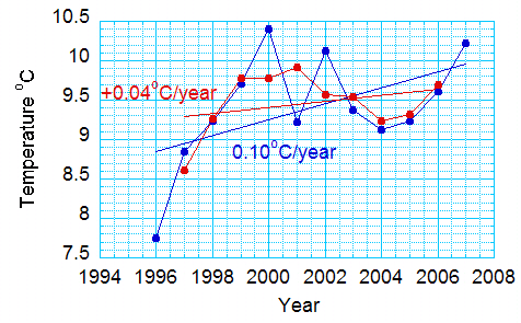
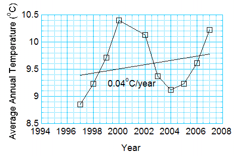
Figure 1. For GLOBE data at 4. Zakladni Skola in Jicin, the Czech Republic, change of trend from leaving out the first point.

In the figure the red points are those used for Fig. 2 of the previous blog. You see the trend, 0.04 degrees Celsius per year. If we add the point from 1996, the trend more than doubles – to 0.1 degrees Celsius per year – 1 degree Celsius per decade.

But 1996 might be a cold year. Remember – weather and climate vary from days to weeks to years to decades.

2001 was a cold year, too, relative to the surrounding points. What if we left 2001 out? How much would you expect 2001 to affect the trend? Note in Figure 2 that there is almost no effect. This is because 2001 is close to the middle of the data record. This makes sense: if you drew a straight line through the points by eye, you would be influenced more by the points at the beginning and end of the time series.

fig2_jicin_minus1996.JPG

Figure 2. For same dataset, but ignoring the cold point in 2001.

Now, you might think that you should get rid of both years. Maybe they are not representative of the long term trend. Something happened in the Jicin area to make it a really cold year in 1996, and a really warm year in 2001. So, you plot the data without either of the two points.

fig3_jicinminusboth.jpg

Figure 3. Same data as for Figures 1 and 2, but minus the averages for 1996 and 2001.

Now we are back to the trend in the first graph – 0.04 degrees Celsius per year!

Someone might look at Figure 3, and say that the average temperatures are just going up and down with time, like the seasons. And, that the trend is just because you didn’t have two (or three, or four) complete oscillations! You couldn’t really say this person isn’t right without having temperature measurements from before 1996.

Obviously, the actual value of the temperature trend depends on how you look at the data! You might try this exercise for other stations in the data provided in the last blog.

Let’s try this exercise for the global points in Figure 7 of the last blog:


Table: Global Annual Average Temperature minus the 1961-1990 Mean. Source, Climate Research Unit, Hadley Centre, UK.

Year Anomaly
1996.0 0.13700
1997.0 0.35100
1998.0 0.54600
1999.0 0.29600
2000.0 0.27000
2001.0 0.40900
2002.0 0.46400
2003.0 0.47300
2004.0 0.44700
2005.0 0.48200
2006.0 0.42200
2007.0 0.40200

(The alert reader will notice that Figure 7 in the previous blog is slightly different now – I had accidentally included data for 2008, which is incomplete.)

fig4_hadcrut3recent.JPG

Figure 4. For the most recent 12 years of the Hadley Climate Research Unit data, the effect of ignoring “extreme” points in the time series.

Note from Figure 4 that the slope varies depending on the data selected, but that the trends remain positive.

Reducing the influence of extreme points by smoothing

Recall last time that I took out the seasons because I thought they might affect the trend. Climate scientists average in time to get rid of the effect of large year-to-year changes like the ones in 1996 and 2001.

To show the effect of smoothing the data for Jicin, I will do a “three-point running mean average.” This means that I will average the first three temperatures and the first three years. That is, I will average

7.7500
8.8500
9.2300 to get 8.61

And I will average the years, too

1996
1997
1998 to get 1997

Then I will average the next three temperatures for 1997, 1998, and 1999 to get the temperature for 1998, and so on. Let’s say how this smoothing affects the data

fig5_jic_3-pt_mean.jpg

Figure 5. For Jicin data, change in trend from smoothing the data.

And you might want to try four-point averages or five-point averages. The fact that the trend is positive, no matter what we do, gives us a little more confidence that there is a warming trend. Just as adding more stations would. But no matter how good the data in Figure 4, this is a trend only for one place – and only for 12 years.

Defining the average temperature

Unlike trends, which are affected by where the numbers are in time, the year doesn’t matter when you take an average. The larger the number of points, the less difference an odd year makes. Let’s do the averages for Jicin, starting with 2 years, then three years, then four years, and so on, for the complete record, to see how each new year affects the average temperature. The results are in Figure 6

fig6_jicinprogressiveavg.JPG

Figure 6. For the Jicin data set, the average as a function of the number of points. To take the average, we start by averaging 1996 and 1997 (two points), then 1996, 1997, and 1998 (3 points), and so on.

As you can see, even the large changes at the end don’t really show up much in the average. And I think you can also see that, the more points in the average, the less one difference one more point will make.

Climatologists have chosen to take their average over 30 years. Thus the HAD.CRUT3 curve in Figure 7 of the last blog is relative to a thirty-year average – from 1961 to 1990.

Posted in Air Temperature, Atmosphere, Climate Change, Data included, Seasons and Biomes | Leave a comment

Are there temperature trends in the GLOBE student records?

Recently announced at the GLOBE Learning Expedition was the upcoming worldwide GLOBE Student Research Campaign on Climate Change, 2011-2013. This campaign will enhance climate change literacy, understanding and involvement in research for more than a million students around the globe. The GLOBE Program Office is encouraging students to contact the GPO with research ideas in areas such as water, oceans, energy, biomes, human health, food and climate. Please send your Climate Change Campaign research ideas to ClimateChangeCampaign@globe.gov.

With the upcoming GLOBE Student Research Campaign on Climate Change in mind, I thought it might be interesting to check for temperature trends in the data from GLOBE schools. (A preliminary version of the yearly-averaged GLOBE student data is included at the end of this blog.)

GLOBE was founded in 1995. By 1996, some schools were already recording temperature data regularly. This provides us with up to 12 years of data from some schools.

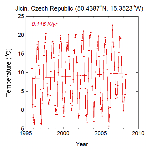
Figure 1 shows an example of a long record of monthly mean temperature.

fig1jicenmonthly.jpg

Figure 1. Monthly average temperatures from 4. Zakladni Skola in Jicin, the Czech Republic. The straight line through the data in a “best fit” linear trend determined by least-squares regression.

Figure 1 shows strong seasonal changes, with monthly average temperatures ranging from below freezing to around 20 degrees Celsius. While there is a long-term trend, the large departures from the trend line indicate that the estimate of warming rate is rather uncertain.

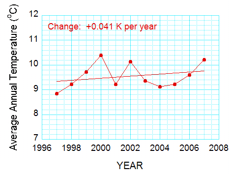
I decided to re-compute the trends by taking yearly averages. If a month was missing, I assigned a mean temperature equal to the average of the data from the two surrounding months (Fortunately, such gaps occurred in the spring or autumn, when filling in the data like this makes some sense). If too many months were missing, I didn’t include the year in the averages. Figure 2 shows the yearly-averaged data for 4. Zakladni Skola.

Note that the “best-fit” line in Figure 2 still shows a warming – but a different value. This is the result of the uncertainty in the linear trend, from a purely statistical point of view. This is not surprising – even the yearly averages don’t fit on a straight line. In fact the warmest year is 2000, near the beginning of the record.

fig2jicin.jpg

Figure 2. Average annual temperatures for the data in Figure 1. Note that the “best-fit” line still shows a warming, but a larger value.

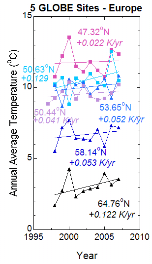
We can reduce the uncertainty by adding more data. So I include data from five other schools in Europe in Figure 3.

fig36siteseurope.jpg

Figure 3. Temperature trends for six schools in Europe, selected so that no two schools are in the same country. Represented are Belgium, Estonia, Finland, Germany, and Hungary, as well as the Czech Republic.

In Figure 3, the best-fit trend lines for all six schools show warming. Note that the most rapid warming rates are at the farthest-north latitudes. Figure 3 gives us some confidence that Europe has been warming for the last decade, but there are year-to-year changes that are much larger than the 10-year trend. These short-term changes tell us there is a lot of uncertainty in the trend lines, but the fact that there are six lines instead of one gives us a little more confidence that the result might be “real” for the roughly 10 years data were collected.

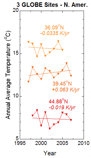
For comparison, we take three sites in the United States, selected for having a continuous data record (Figure 4). In this case, two out of the three sites actually show cooling! This is quite different from Europe. However, as in the case of Europe, the year-to-year changes are greater than the long-term trend.

fig4sitesnamer.jpg

Figure 4. As for Figure 2, but for three schools in the United States.

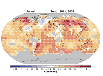
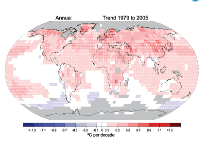
Such differences could be real. The maps of temperature changes in Figure 5 show that the trends over 30 and 100 years show a lot of variation. For both time periods, the figure shows that Europe is getting warmer. Both periods also show more warming at higher northern latitudes. Results for the United States are mixed. Between 1905 and 2005, temperatures were warming over the northwest United States but cooling over the southeast United States. However, temperatures were warming over most of the United States between 1979 and 2005, with the possible exception of part of Maine (northeast corner of the United States).

fig5topncdc3-9_left.gif

fig5botncdc_ar4-fig-3-9_right.gif

Figure 5. Linear trend of annual temperature for 1905-2005 (top) and 1979-2005 (bottom). Areas in gray don’t have enough data to get a good trend. The data were produced by the National Climate Data Center (NCDC) from Smith and Reynolds (2005, J. Climate, 2021-2036). This figure and an excellent commentary on recent climate change are found at www.ncdc.noaa.gov/oa/climate/globalwarming.html.

In this blog, I have avoided using statistics to estimate the uncertainty in the trends, but I think you can see two things. First, even with all this carefully-collected data, there is uncertainty in the local trends; but the uncertainty can be reduced by including more data in the same region. And second, the trends can be quite different in different parts of the world.

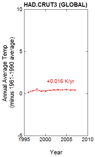
To close, I include two more plots. The first is a version of the well-known curve that shows Earth’s average temperature warming with time. I plotted the curve from data from the Climate Research Unit (CRU) of the Hadley Centre in the United Kingdom

fig6newhadcrut3.JPG

Figure 6. Annual average temperature, averaged over the globe. From the UK Hadley Centre (www.cru.uea.ac.uk/cru/data/temperature/hadcrut3gl.txt).

fig7newhadcrut3since96.jpg

Figure 7. Data from Figure 6, with linear trend based on data from 1996-2007, on the same scale as for Figure 2 and 3.

The second plot is based on data since 1996 and plotted on the same scale as for the GLOBE schools. Notice how tiny the change is! This is, of course, because some parts of the Earth were cooling or warming less rapidly. But there is much more information included in that curve – and hence a lot more statistical certainty. Also, the scientists who worked on the data worked very hard to remove the effects of changing thermometers or station location, beginning and ending of observations, and many other things that can cause artificial trends. (By the way, a plot of the averages of the nine GLOBE sites produces a very slight warming with time of 0.0018 degrees Celsius per year – with the temperature peak in the year 2000 really standing out).

Clearly, this simple-looking curve took a lot of careful work to produce!

GLOBE STUDENT DATA

Below are the data used for Figures 1-4. For details in processing see the text.

YEAR 1 2 3 4 5 6 7 8 9 10
1997.0 xxxx xxxxx 16.34 xxxxx xxxxx 11.70 xxxxx 8.85 xxxx xxxx
1998.0 7.73 1.69 16.15 10.75 10.23 13.40 10.17 9.23 5.51 9.43
1999.0 8.38 2.74 14.67 12.22 10.70 12.60 8.69 9.71 7.18 9.65
2000.0 6.57 4.28 16.09 13.55 8.830 12.00 10.60 10.40 7.72 10.00
2001.0 8.13 2.34 14.74 11.48 10.67 13.28 10.21 9.22 6.43 9.61
2002.0 6.21 2.72 15.15 11.11 10.40 12.96 10.37 10.13 6.38 9.49
2003.0 6.72 2.88 15.57 11.82 10.97 12.18 9.56 9.37 6.28 9.48
2004.0 6.95 2.98 16.42 11.23 10.35 12.65 9.95 9.13 7.05 9.63
2005.0 8.10 3.95 15.42 10.78 10.14 13.05 10.63 9.23 5.87 9.69
2006.0 7.90 3.16 xxxxx 12.66 12.54 13.87 9.28 9.61 7.34 xxxx
2007.0 7.24 3.55 xxxxx 12.35 10.48 12.40 10.83 10.22 7.19 xxxx

xxxx – missing data (see below)

Documentation of the data

Summary of Sites

GLOBE school locations

  1. Hartland, Maine, USA
  2. Utajarvi, Finland
  3. Tahlequah, Oklahoma, USA
  4. Karcaq, Hungary
  5. Eupen, Belgium
  6. Waynesboro, Pennsylvania, USA
  7. Hamburg, Germany
  8. Jicin, Czech Republic
  9. Tartumaa, Estonia
  10. Average of Temperatures 1-9

Yearly averaging

Missing months are “filled in” by averaging the surrounding months. This was done when one month was missing or two months was missing (very rare). Fortunately, the missing data tended to occur in the spring or autumn, when the missing temperatures would be expected to be between the temperatures of the neighboring months. The average was then computed by summing up the data for all 12 months and then dividing by 12.

Average of all nine sites

The average is found by summing up the temperatures in columns 1 through 9 and then dividing by 9. If a temperature is missing (as in the first row, 1996), an average is not computed. Why do you think we did it this way? Two out of the three sites (3 – Tahlequah and 6 – Waynesboro) are the two warmest of the nine, and the third (8 – Jicin) is in the middle of the temperature range. If we used the average of those three points, it would make the average temperature in 1996 too warm.

NOTE: The data here are reported to two decimal places, while some of the data used for the graphs has three or four decimal places, so results might vary slightly from the results shown here.

What can be done to “improve” the dataset? We will be calculating averages for other schools with long temperature records and adding them.

Posted in Air Temperature, Atmosphere, Climate Change, Data included, Seasons and Biomes | Leave a comment

Hail and Thunderstorm Updraft Strength

This blog was written just before departing for the GLOBE Learning Expedition meeting in South Africa. I’ll be posting some additional blogs about the meeting in the coming weeks. In the meantime, after you read this blog, check out the GLOBE home page for student blogs and photos!

The weather report always tells you the wind direction and speed reported by a weather station near you. Sometimes you hear about the strong winds in the “jet stream” that exists several kilometers above the ground.

Did you ever wonder how strong the winds are in a thunderstorm? The up and down winds, I mean. You can make a rough guess on how strong the updraft in a thunderstorm is, if you have hail.

On the night of 4 June 2008, we had hail, so I decided to see how big it was. There are two ways to do this. You can go out and collect the hail, and measure it before it melts (which I have done), or you can take a picture of the hail – with a ruler or something to compare the hail to, and measure the size of the hailstones from a photograph.

dscn0547.JPG

Figure 1. Picture of hail on our back porch, 1830 Local Daylight Time, 4 June 2008. Typical size is one centimeter in diameter. Since the slate surface was warm some of the hail that fell earlier may have melted some. Location: north part of Boulder, Colorado, USA.

dscn0551.JPG

Figure 2. As in Figure 1, but hail on the grass. Typical size is 1 centimeter in diameter. The grass was cool enough so that the hail wasn’t melting as much as in the first picture.

In both pictures, the larger hailstones are typically about a centimeter in diameter, with a few that even larger. I don’t think there was much melting after the hailstones hit the ground, because I was taking the pictures as the hail was falling.

How can hail size tell you how strong the updraft is? The updraft has to be strong enough to hold the hail while it is growing. In other words, the hail continues to grow until its downward speed (which goes up with size and weight) is greater than the upward speed of the air.

Hail fall speed is determined by a balance between two forces: the downward pull of gravity and the drag force (air resistance) on the hailstone created by the air. As the hailstone falls faster, the air resistance gets bigger. Gravity of course stays the same. When the drag force is equal to the force of gravity, the hailstone reaches a constant downward speed, called its terminal velocity or terminal fall speed. The updraft has to be this strong to keep the hail from falling.

So we use the terminal fall speed to estimate the updraft speed. The hail will fall to the ground when the updraft weakens slightly, or when the hailstorm travels out of the updraft horizontally.

People have estimated the terminal fall speed of hail using equations, and they have measured it. I actually saw scientists measuring the fall speed of artificial hailstones (same shape and density as hailstones, but not ice) by dropping them down a stairwell that extended vertically about seven stories. Assuming a story is about 3.7 meters, that’s about 26 meters. Sometimes scientists measure the fall speeds of hail in nature. They can photograph them falling with a high-speed camera using strobe lights that flash on at regular intervals. Or they can measure hail vertical speed with a Doppler radar pointing straight up. It is more likely that the “natural” hailstones reached their terminal fall speeds than those in the stairwell.

Knight and Knight (2001) argue that the terminal fall speed is related to:

  1. Air density (hail falls faster through thinner air)
  2. Hailstone density (less dense hailstones fall more slowly)
  3. Drag coefficient (the effectiveness of the air in slowing down the hailstones)

The shape of the hailstone is also important, but Knight and Knight assume the hailstones are spherical to keep the problem simple.

The graph shows how hail terminal velocity (or fall speed) is related to hail diameter.

hailfallspeeds.JPG

Figure 3. Hail fall speed (and hence updraft needed) as a function of hail diameter. Red curves are from Knight and Knight (2001); Black points read off figure in http://www.jdkoontz.com/articles/hail.pdf.

For our one-centimeter hailstone, the graph shows a range of values, based on assumptions on air density at the height the hail is forming (taken by Knight and Knight as somewhere around 5.5 kilometer above sea level, where the air pressure is about 500 millibars or hectoPascals, temperature 253.16 K), drag coefficient, and the ice density in the hailstones. I picked up the hailstones, and they appeared to be solid ice rather than soft, so the ice density was probably about 0.9 grams per cubic centimeter. This suggests the updraft speed was between 13 and 18 meters per second, or between 29 miles per hour and 40 miles per hour.

According to the U.S. National Severe Storms Laboratory website, a one-centimeter hailstone falls at about nine meters per second – meaning that the updraft has to be that strong. This means the air had to be moving upward at 32 kilometers per hour or 20 miles per hour. This is more consistent with the less-dense hail.

So – to be safe, I would say the updraft overhead was between 9 meters per second and 18 meters per second. There are too many factors that we don’t really know to get much more accurate than that. This is between 32 and 65 kilometers an hour, or between 20 and 40 miles per hour.

The Encyclopedia of Climate and Weather (New York, Oxford University Press, Stephen Schneider) quotes a 47 meter per second fall speed (or necessary updraft) for a 14.4 centimeter hailstone, translates to a little over 100 miles per hour!

So – next time you have a hailstorm, measure the diameter of some hailstones to find out roughly how strong the updraft was! But if the hail is large, either photograph it from a safe place or wait until the large hail has stopped. If you don’t have a camera, collect some hail stones, put them in a plastic bag, and put them in a freezer until you have time to measure them.

Related blog: “More about Hail,” (No 19, 1 November 2006).

Reference:

Knight, Charles, and Nancy Knight, 2001: Hailstorms. In Severe Convective Storms, C. A. Doswell III, Ed., Meteorological Monographs, volume 28, No. 50. Published by the American Meteorological Society

Posted in Atmosphere, Backyard Science | 2 Comments