The Scientific Method and GLOBE

This week we have a guest blogger, Dr. Dixon Butler. Dr. Butler was the GLOBE Chief Scientist from 1996-2003 and now works as a consultant to NASA.

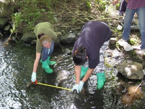
students completing GLOBE hydrology protocols
Students Working on GLOBE Hydrology Protocols

The general explanation of the scientific method focuses on comparing two situations that differ in only one clearly defined way. One case serves as the control while the other is the experiment. The results must be replicable as a check that the measurements were made correctly and that any other differences between the control and experiment are insignificant. This is an ideal, but it is impractical when one is studying Earth.

Earth is a complex system with important processes that happen on a wide range of time and space scales. We don’t have another planet to use as a control, so the scientific method must be adapted. In the Earth system, phenomena that happen locally or on short timescales can significantly affect phenomena that take place over larger regions and longer times. The reverse is also true where large scale or long duration phenomena affect small scale and rapid phenomena. For example, the growth of rain forest affects daily storms. In studying Earth, science involves measuring as many phenomena as possible in as many places as possible for as long as possible looking for patterns and correlations.

Earth science research can still involve comparisons, and these are useful, but it is virtually impossible to find two situations that only differ in one specific way. To account for differences that cannot be controlled, research takes a statistical approach. Averages are taken over time and/or space and compared. Differences are analyzed.

For patterns, correlations, and comparisons to be useful, the data for each environmental variable must be intercomparable over time and space. Systematic errors must be avoided.

Because the Earth system obeys scientific laws, these can be used to help understand and even predict environmental phenomena. Today, these laws are incorporated in computer models along with various measured conditions, and the models are used to make comparisons, to assimilate data to better characterize the environment, and to make predictions. The models can be run backward in time to see if they reproduce known past conditions.

The nature of Earth science makes GLOBE possible and worthwhile. The environment around us is constantly changing in ways that are relatively easy to observe and measure. Temperatures vary; clouds blow by; storms come and go; plants bloom. An old Native American saying states that you can never step in the same river twice. So research-quality measurements may be made by students, in some cases even the youngest school children. Because Earth science depends on extensive measurements over time and space and localized phenomena and conditions are significant, student contributed data are an important resource for characterizing Earth. With supports and capabilities provided by GLOBE, students can do science and contribute to understanding the Earth system.

Dixon M. Butler

Posted in General Science, GLOBE Protocols | 51 Comments

Frosty and Frozen: Europe’s Frigid Winter

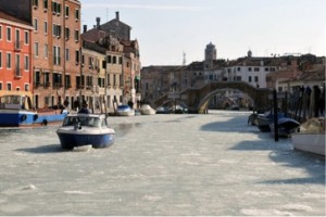
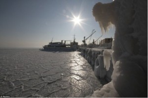
Since the end of January 2012, Europe has been experiencing record-breaking cold temperatures and heavy snowfalls.  Temperatures are dropping to -40°C (-40°F) and below in Europe.  The canals of Venice are freezing over (the first time since 1991) and sections of the Black Sea have frozen (the first time since 1977).  And, Rome has received its first substantial snowfall since 1986.

A small boat cuts through the ice along a canal in Venice. Photo by Marco Sabadin/AFP/Getty Images

The frozen Black Sea

The frozen Black Sea in Ukraine (Reuters photo)

So, why is it so cold in Europe?   Part of the reason for the cold temperatures can be attributed to a climate pattern called the Arctic Oscillation (AO).   There are many different kinds of climate patterns, which are also called teleconnections or oscillations.  Climate patterns can occur at different time scales too – some might change every few weeks, others might take decades to change.   Imagine that you and a friend are on a seesaw – sometimes you are up, sometimes you are down.  Climate patterns work the same way, although the phases are called “positive” and “negative.”  A well-known climate pattern is the El Niño/La Niña Southern Oscillation (ENSO).

When the AO is positive, surface air pressure is low in the Arctic and the cold air stays in the region.  However, when the AO is negative, surface air pressure is high in the polar region and the frigid air spreads into the middle latitudes of the Northern Hemisphere.  (For those of you that have some familiarity with meteorology and air pressure systems – remember that air converges into a low pressure system and diverges from a high pressure system.) Currently, we are in a negative phase of the AO, which can be related to these cold conditions in Europe. Even though North America is also in the middle latitudes of the Northern Hemisphere, it is experiencing a milder (warmer and drier) than usual winter.  Well, this is because there are even more climate patterns in play!  Along with a negative AO, we are also experiencing a positive North Atlantic Oscillation (NAO), which often relates to winters in North America being warmer than usual, and the La Niña phase of ENSO, which has been tied to less precipitation in the American Southeast.  Due to these different climate patterns in play, this winter has been extremely cold in Europe and moderate in North America.

When we have extremely cold temperatures, you might hear people saying that this means global warming isn’t really happening.  However, some scientists think that warming air temperatures in the Arctic are actually causing this extreme cold in Europe.  When sea ice in the Arctic melts, this can cause the phase of the AO to become negative and then can lead to cooler temperatures in the middle latitudes of the Northern Hemisphere.  As the overall temperature of Earth continues to warm and more ice melts in the Arctic, we may see more of these extreme cold events in the middle latitudes.

Scientists are able to discover all of these climate relationships by analyzing large amounts of climate data and looking for patterns.  Having a lot of high quality data is very important to discover these patterns.  If you look at the weather data for your school, do you notice any patterns?  Some should be obvious – like warm air temperatures in the summer and cold air temperatures in the winter.  Can you find any patterns not related to just the seasons?  Depending on how long your school has been recording data, you can probably find patterns in different time-scales too.

The GLOBE Program is encouraging teachers and students to collect weather and climate data, as well as conduct climate-related research investigations, as part of the ongoing Student Climate Research Campaign (SCRC).   Make sure to get your school involved and help contribute to our GLOBE database!

Are you in Europe?  Send us an email or add a comment to let us know your experiences during this extreme weather.

-JSM

Posted in Climate Change, General Science | 5 Comments

Trees are in Trouble: Climate Change and Dying Trees

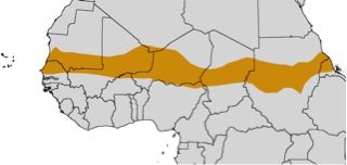
Communities in the Sahel region of Africa depend on trees for firewood, food, building materials, and even medicine.  Anecdotal observations in this savannah climate, a transition region to the south of the Sahara Desert, have suggested the number of trees is decreasing.  A recent study by a group of researchers at the University of California at Berkeley has provided scientific support indicating that trees are indeed dying and the decline is being attributed to climate change.  Scientists looked at aerial photos dating back to 1954, satellite images, climate change records, and actually walked around the Sahel on foot to measure and count trees.

The Sahel zone is a transitional region to the south of the Sahara Desert

The Sahel zone in Africa (image courtesy of kidsmaps.com)

The Scientists found that the average temperature in the Sahel warmed by 0.8 degrees Celsius and rainfall decreased by as much as 48% between 1954 and 2002.  Due to the hotter, drier climate the trees started dying – one out of every six trees present in 1954 died by 2002.  And, not only did specific trees die, but whole species actually disappeared from this region; as much as one in five tree species were no longer present by 2002.  Fruit and timber trees, which require a lot of moisture and also are very important to local populations, were impacted the most.  In general, the scientists found that climate change is causing vegetation zones to shift, moving toward areas with more moisture.

A dead Ironwood tree in Senegal

A dead Ironwood tree in Senegal (photo by Patrick Gonzalez)

One of the Intensive Observing Periods (IOPs) of the Student Climate Research Campaign (SCRC) is the Climate and Land Cover project. During this campaign, students take photographs throughout the year and classify land cover areas (check out the land cover protocol) near their schools and upload these data to the GLOBE database.  These kinds of photographs are exactly the kind of data scientists need to study how land cover changes over time, including to monitor the presence of trees in various regions around the world.  GLOBE students can contribute to the database by participating in these IOPs, and help study trends in their local landscape and vegetation over time.

Have you heard stories (anecdotes) about land cover changing due to climate change near your school or home?  If so, send us an email or add a comment to let us know!  And, don’t forget to take part in the Climate and Land Cover IOPs!

-JSM

Posted in Climate Change, Land Cover | 5 Comments

Was 2011 really hot or not?

If you’ve seen the science news headlines in the past few weeks, you may have noticed stories summarizing how 2011 ranked in climate history.  What is interesting is that the headlines have been a bit contradictory.  For example, if you’ve read the story as reported by the National Aeronautics and Space Administration (NASA), the headline reads “NASA finds 2011 ninth-warmest year on record”, which to me implies it was another record hot year given that it made the top ten list.  Nonetheless, another story reported in ABS news touts that the world wasn’t quite as hot in 2011, coming in ranking only 11th in the history books.  The latter report was based on findings by the National Oceanic and Atmospheric Administration (NOAA) and while the difference in rankings between the two reports is rather small, the sentiment conveyed by these headlines may lead readers to interpret these results as very different findings.

How could there be such a discrepancy in how two leading U.S. government agencies rank a given year in the climate record books?

Primarily, the difference is because each agency that monitors global temperature trends calculates global temperature differently.  Choices on how to average the data and the source of data to use can easily yield different results.  Basically, different methodologies can lead to different results.  This is why it is so important for scientists – including GLOBE student scientists – to document exactly what methods they used in their research!   However, as it turns out, both NASA and NOAA calculated exactly the same thing– that the global temperature in 2011 was 0.51°C (0.92°F) above the 20th century average – it’s just the way each ranked this 2011 statistic that was different.

How is the public supposed to make sense of these apparently contradictory findings?

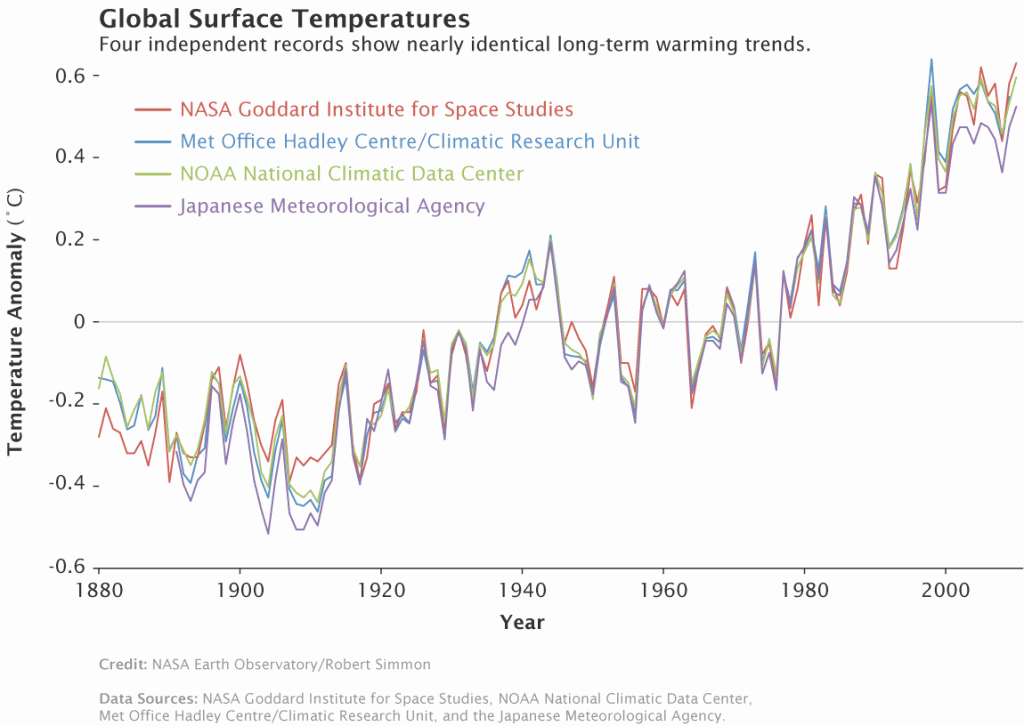
Given that the actual temperature anomaly for 2011 was exactly the same between the NOAA and NASA reports, it is less important to look at rankings. Rather it is key to pay attention to the overall trends in the data.  Other international agencies that monitor global temperatures (such as the United Kingdom Hadley Centre and Japanese Meteorological Agency) also show similar overall trends.  Regardless of how each agency ranks a particular year, all four records show peaks and valleys that fluctuate essentially in sync with each other since 1880 (see Figure 1).  Furthermore, they all also show rapid warming in the last few decades, with the latest decade being the warmest on record.

Four records of global surface temperature anomaly since 1880

Figure 1. Comparison time series of global surface temperature anomalies since 1880 from four agencies that monitor global temperature trends. (From http://www.giss.nasa.gov/research/news/20110113/)

What’s the moral to this story?

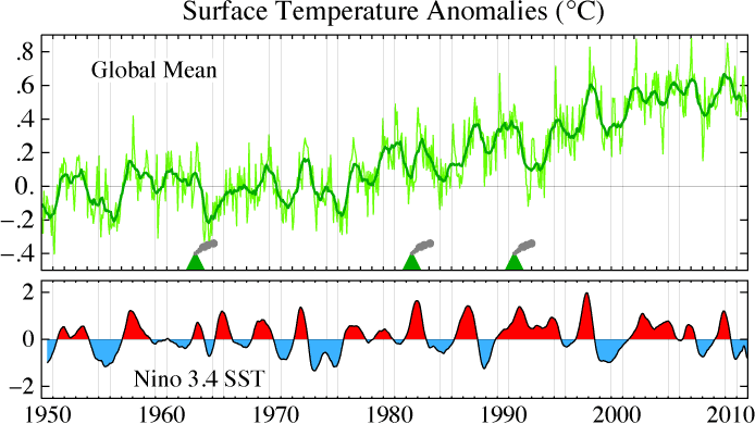
Despite how it is ranked, 2011 was yet another exceptionally warm year compared to the rest of the climate record since 1880.  While it was not as hot as 2010 (which by many accounts tied for the world’s hottest year on record) likely due to cooling effects of La Nina (see Figure 2), the 2011 annual temperature anomaly was still similar to the warm anomalies of the last decade.

Surface temperature anomaly and ENSO index since 1950

Figure 2. NASA Goddard Institute of Space Studies (GISS) surface temperature anomalies since 1950 shown as related to the El Nino Southern Oscillation (ENSO) index (bottom). The ENSO periods of La Nina (shaded in blue) and major volcanic eruptions correspond with cooling trends. (From http://data.giss.nasa.gov/gistemp/2011/)

Moreover, it is important as you read scientific studies, including science stories in the news, that you keep an open mind and explore all possibilities for how and why the results were determined.   After all, as we have shown here, two different headlines could really be reporting the same thing!

GLOBE activity: Check out the “From Weather to Climate” activity to learn how weather data gets transformed into climate data and how there are different ways to make these calculations.  Which is the correct method?  There really isn’t one, but some methods may be more widely accepted than others, so it’s always good to do some research to see how other researchers have calculated climate data if you want to compare your findings with others!

-ST

Posted in Climate, General Science | Leave a comment

The Mississippi River and Aquatic Dead Zones

From January 22 to 26, 2012, scientists from around the world gathered for the American Meteorological Society annual meeting, which was held in New Orleans, Louisiana.  Scientists from the GLOBE Program stayed next to the beautiful Mississippi River.

The Mississippi River in New Orleans (photo courtesy of Dr. Donna Charlevoix)

The Mississippi River is the lifeblood of New Orleans and has so impacted the city that the city was actually developed around it. The first buildings were constructed around the river edge, which has the highest ground, and now gives the city a crescent shape if you were looking down on it from above.  This is why the city is sometimes referred to as the Crescent City.

An aerial photo of New Orleans, image from smithsonian.org, photographer Tyrone Turner

The Mississippi River is the largest river in North America and travels over 4000 km from Minnesota south to Louisiana where it drains into the Gulf of Mexico. This river, like all rivers, is living and the health of the river can be measured in several ways. This is similar to how you can use GLOBE protocols to measure environmental phenomena in different ways, depending on what information you want to discover.

Here in New Orleans we see the river every day as we walk to the scientific conference. The very presence of being in New Orleans triggers reminder of Hurricane Katrina in 2005, which was the worst hurricane experienced by the city and the costliest and deadliest hurricane to impact the United States. You may be surprised to learn that the impacts of hurricanes and the health of the river are closely related.

All along the Mississippi River, the land is very fertile and there is abundant agriculture. The natural flooding of the river on to the flood plain over hundreds of years has deposited nutrients and minerals into the soil resulting in soil that is very fertile. However, the agriculture is impacting the river because runoff from these agricultural areas contains excess amounts of nitrogen and phosphorus – they are changing the chemical makeup of the river. As the water flows downstream and into the Gulf of Mexico, the pollutants accumulate at the mouth of the river and have created a “dead zone” just off the Delta, which adversely impacts aquatic life. An aquatic dead zone is an area with very low oxygen content; we say that it is hypoxic. The Gulf of Mexico is not the only dead zone. This image produced by NASA shows dead zones in several locations around the world with large concentrations along the eastern seaboard of the United States and a second area in northern Europe.

Aquatic Dead Zones around the World – click on the picture for a larger image

Do you live near one of these dead zones? If you are near an aquatic dead zone or live near any body of water, use the GLOBE hydrology protocols to investigate the quality of the water. Either add a comment or send us an email to let us know what you find!

-JSM

Posted in Earth System Science, General Science, Hydrology | 3 Comments