Summary of the Surface Temperature Field Campaign

Below is a summary of the results of Dr. Kevin Czajkowski’s surface-temperature field campaign conducted during December, 2008. The recently-posted blog “More Misconceptions about Climate Change, Part 2,” is just below this one. — PL

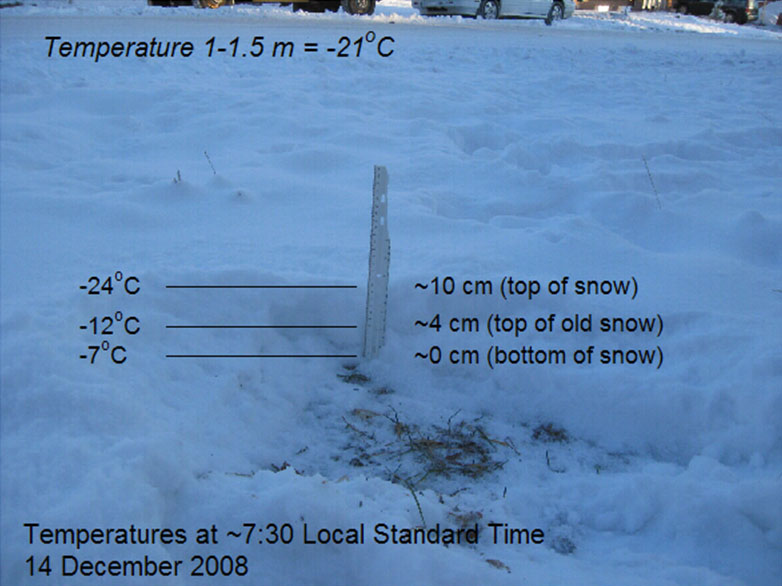
I wanted to write a wrap-up for the surface temperature field campaign. Dr. LeMone posted a great discussion of the relationship between surface temperature and air temperature (scroll down to 6 January blog). I felt cold just reading about temperatures of –27 C.

Many of the observations from the field campaign have been posted but not all have yet. If you still need to get your data online, please do so soon, as students from around the world will be working on their inquiry-based research projects. They may want to use your data. Also, several schools were not able to participate in December so they took observations in January and some schools are still taking observations now.

Thus far, 58 schools have entered data for the field campaign and there have been a total of 1584 observations. If you add up all of the surface temperature, snow, clouds and contrail observations, there have been 36,432 observations taken during the field campaign. Could you image trying to take all of those observations by yourself? I couldn’t.

I am really impressed with some of the schools that had many observations submitted. The school with the most observations was John Marshall High School in Glendale, West Virginia, USA with 122. Other notable schools are: Peebles High School, Peebles, Ohio, USA (94), Dalton High School, Dalton, Ohio, USA (77), and Oak Glen High School, New Cumberland, West Virginia, USA (81), elementary schools Main Street School, Norwalk, Ohio, USA (90) and St. Joseph School, Sylvania, Ohio, USA (84). In addition, a couple of schools in Poland took a large number of observations, Gimnazium No 1, Sochaczew, Poland (72) and Gimnazjum No 7 Jana III Sobieskiego, Rzeszow, Poland (62).

This year the weather cooperated pretty well and many of you were able to observe the surface temperature with snow on the ground. The deepest snow depth (288 mm) was measured by students at Nordonia Middle School, Northfield, Ohio, USA. Fifteen of the lowest 20 surface temperatures recorded were observed by students from Moosewood Farm Home School, Fairbanks, Alaska, USA. The lowest surface temperature that they recorded was –32 degrees Celsius. Another cold surface temperature (-26 degrees Celsius) was noted by Gimnazium No 1, Sochaczew, Poland. All of the warmest surface temperatures were recorded by students at Brazil High, Brazil Village, in Trinidad and Tobago with temperatures of +35-50 degrees C.

fig1.gif

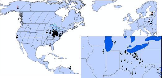
Figure 1: Schools in GLOBE that participated in the surface temperature field campaign. Many are in Ohio because that is where I have funding for professional development.

Figures 2 and 3 show the relationship between surface temperature and snow in an area mainly covering Ohio, Michigan and West Virginia. These observations were not separated on the basis of water in the water.

fig2.gif

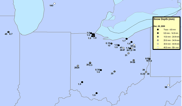
Figure 2. Student observations of snow depth, 8 December, 2009.

fig3.gif

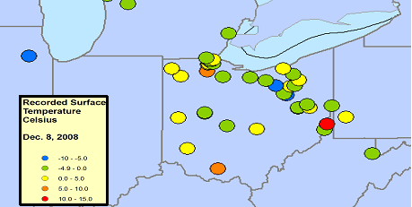
Figure 3: Surface temperature as recorded by students on 8 December, 2008.

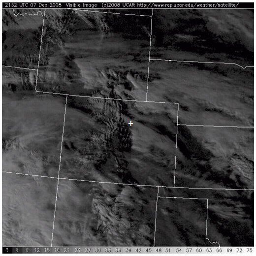
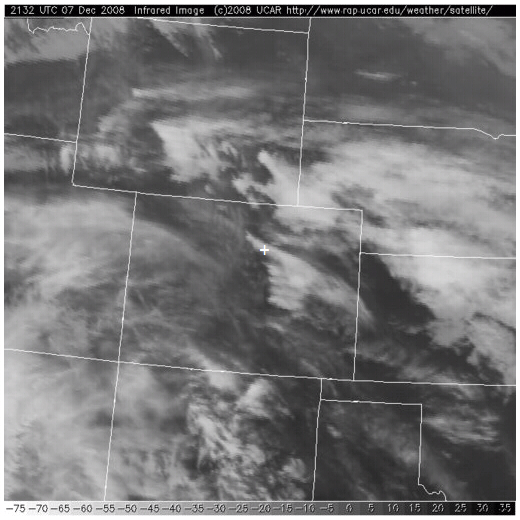
There is one thing to notice about the satellite imagery during this time period. Clouds obscured the ground most of the time. The image below, 7 December 2008, was the clearest image we could obtain of the Great Lakes regions. It seems that the observations in eastern Europe were cloud covered even more. The MODIS image depicts the surface temperature as the satellite went over and took observations on , 7 December 2008. The orange depicts part of Lake Huron that was ice covered.

fig4.gif

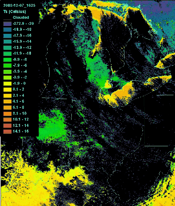
Figure 4. MODIS Surface temperature product (MOD11), 7 December, 2008.

Here is the list of all of the schools that participated.
Roswell Kent Middle School, Akron, OH, US [37 rows]
OHDELA, AKRON, OH, US
Capital High School, Charleston, WV, US [6 rows]
Dalton High School, Dalton, OH, US [77 rows]
Chartiers-Houston Jr./Sr. High School, Houston, PA, US [28 rows]
Lakewood Middle School, Hebron, OH, US [10 rows]
Cloverleaf High School, Lodi, OH, US [60 rows]
The Morton Arboretum Youth Education Dept., Lisle, IL, US [9 rows]
Peebles High School, Peebles, OH, US [94 rows]
North Marion High School, Farmington, WV, US
Christensen Middle School, Livermore, CA, US [2 rows]
Gimnazjum No 7 Jana III Sobieskiego, Rzeszow, PL [62 rows]
Gateway Middle School, Maumee, OH, US [9 rows]
Penta Career Center, Perrysburg, OH, US [8 rows]
Canaan Middle School, Plain City, OH, US [28 rows]
Mill Creek Middle School, Comstock Park, MI, US [24 rows]
Brazil High, Brazil Village, TT [30 rows]
Kilingi-Nomme Gymnasium, Parnumaa, EE [42 rows]
Montague Elementary School, Montague, NJ, US [2 rows]
Swift Creek Middle School, Tallahassee, FL, US [19 rows]
National Presbyterian School, Washington, DC, US [15 rows]
The Bryan Center, Bryan, OH, US [16 rows]
Baltimore Polytechnic Institute, Baltimore, MD, US [2 rows]
Reams Home School, Wellington, OH, US [36 rows]
Maumee High School, Maumee, OH, US [16 rows]
Whittier Elementary School, Toledo, OH, US [6 rows]
Huntington High School, Huntington, WV, US [29 rows]
St. Joseph School, Sylvania, OH, US [84 rows]
Russia Local School, Russia, OH, US [24 rows]
Warrensville Heights High School, Warrensville Heights, OH, US [2 rows]
WayPoint Academy, Muskegon, MI, US
Gimnazium No 1, Sochaczew, PL [72 rows]
Moosewood Farm Home School, Fairbanks, AK, US [27 rows]
St. Michael Parish School, Wheeling, WV, US [14 rows]
Anthony Wayne High School, Whitehouse, OH, US [13 rows]
Bellefontaine High School, Bellefontaine, OH, US [36 rows]
Oak Glen High School, New Cumberland, WV, US [81 rows]
Barberton High School, Barberton, OH, US [37 rows]
Nordonia Middle School, Northfield, OH, US [34 rows]
Aurora Elementary School, Aurora, WV, US [13 rows]
Orrville High School, Orrville, OH, US [15 rows]
Bowling Green Christian Academy, Bowling Green, OH, US [26 rows]
Polly Fox Academy, Toledo, OH, US [18 rows]
McTigue Middle School, Toledo, OH, US [9 rows]
Highlands Elementary School, Naperville, IL, US [8 rows]
South Suburban Montessori School, Brecksville, OH, US [34 rows]
NASA IV&V Educator Resource Center, Fairmont, WV, US
John Marshall High School, Glendale, WV, US [122 rows]
Boys’ Village School, Wooster, OH, US [9 rows]
Birchwood School, Cleveland, OH, US [43 rows]
Lebanon High School, Lebanon, OH, US [9 rows]
Central Catholic High School, Toledo, OH, US [4 rows]
Eastwood Middle School, Pemberville, OH, US [18 rows]
Orange Elementary School, Waterloo, IA, US
Hudsonville High School, Hudsonville, MI, US [27 rows]
The University of Toledo, Toledo, OH, US [32 rows]
O. W. Holmes Elementary School, Detroit, MI, US [11 rows]
Main Street School, Norwalk, OH, US [90 rows]

That is all from this year’s surface temperature field campaign. Maps were prepared by Nancy Cochran and Timothy Ault of the University of Toledo.
Dr. C.

Thank you, Dr. C., and all the students and teachers who participated in this field campaign! – PL

Posted in Atmosphere, Field Campaigns | Leave a comment

More Misconceptions about Climate Change, Part 2

Misconception: The carbon dioxide record at Mauna Loa is not reliable because Mauna Loa is a volcano.

It is true that volcanoes give off carbon dioxide. In fact, paleoclimatologists talk about “greenhouse worlds” with more carbon dioxide, much of which is thought to be from volcanoes. However, most of the time, the air at Mauna Loa is not influenced by volcanic gases released nearby. When air influenced by nearby volcanic gases is sampled, these data are not counted in the average. Similarly, at Cape Point, South Africa, which we visited during the GLOBE Learning Expedition, scientists try to avoid using data influenced by nearby Cape Town (see 11 Aug 2008 blog).

To see what the carbon dioxide trends are in different parts of the world, I went to the NOAA Earth System Research Laboratory Web Site). Here, you will find data from stations around the world. These measurements are taken at about 30 m above the surface. Figure 4 shows an example.

figure_4_co2_time_series.JPG

Figure 4. CO2 time series for Halley Station, Antarctica. From NOAA ESRL site (see text). The observations are the black points. The turquoise points are from the “Carbon-Tracker” model. USE graph without gap.

Just for fun, I looked at 15 such plots, and drew a line by eye (“faired” the line) to find the trend in carbon dioxide concentrations using the end points at the beginning (1 January 2000) and end (31 December 2008). Figure 5 shows what I did for the plot in Figure 4.

figure_5_co2_series_with_line.JPG

Figure 5. Figure 4 with the straight line I drew through the data (I tried to follow the black points, which are the observations). The values I read off are at the ends of the line, i.e., at the beginning of 2000 and the end of 2008.

Then I put the numbers in a table, and took the differences for each day. Figure 6 is a plot of the values at the beginning and end of the period for the 13 stations that didn’t have too much scatter. (The other two, in Europe, had considerable scatter, and higher rates of increase – around 2.6-2.7 parts per million (PPM) per year).

figure_6_co_2_conc_v_lat.JPG

Figure 6. End points of the straight line drawn by eye through curves like that in Figure 3. Data from NOAA Earth System Research Laboratory/Global Monitoring Division.

It is interesting to see that the highest carbon-dioxide concentrations occur in the northern middle latitudes, where the most people (and cities, and factories, and cars) are. Even so, the carbon dioxide concentrations at the beginning and end of the period change little with latitude. Finally, the changes with time (over eight years) are about the same at all locations plotted. If we average the yearly trends, we find a carbon-dioxide increase of 2 PPM per year, with very little scatter (standard deviation 0.08 PPM per year, standard error 0.022 PPM per year).

Misconception: The warming pattern is related to the pattern of carbon dioxide concentration. Where carbon dioxide increases faster, the temperature is warming faster.

It is true the carbon dioxide has “weather.” Carbon dioxide concentrations near the surface can vary a lot (several tens of parts per million) from day to night, and from summer to winter at a given location (see 7 September 2007 blog) . Carbon dioxide concentrations tend to higher over more populated regions, as illustrated by Figure 7, with lower values over the ocean.

figure_7_co2_dailycolumn_nam1×1_2007122900.png

Figure 7. “Carbon-Tracker” model-based Carbon dioxide “weather” over North America based. The concentrations are the averages for a column of air. From http://www.esrl.noaa.gov/gmd/ccgg/carbontracker/co2weather.php.

However, as shown in Figure 6, the long-term trends in carbon dioxide don’t vary that much.

What then explains why some areas are warming more than others? Let’s start by thinking about what changes the temperature on a daily basis.

It is true that the “greenhouse” effect of both carbon dioxide and water vapor (which varies quite a bit) has an effect on temperature change through radiative processes. In fact, the water vapor content changes a lot more than the carbon dioxide content. Something closely related to “average column carbon dioxide content” is the “precipitable water,” or the amount of water vapor in a column, that, if condensed, would fall at the surface beneath that column. One can find examples of precipitable-water maps on the web. For example, visit http://weather.unisys.com/upper_air/ua_con_prec.html. You will find that precipitable water over the United States varies by a factor of five, ten, or more!

However, temperature changes near the surface are mostly driven by heating (or cooling) of the ground, and the ground in turn heating (or cooling) the air. Of course radiation plays an important part here, too. During the day, when the ground is heated, the heating is especially effective, since air warmed by the ground is buoyant. This buoyant air rises, carrying heat upward with it. Clouds also affect temperature change. Cloudy days are often cooler than days with clear skies, because less sunlight reaches the ground. Clouds at night “trap” heat near the ground, keeping the air from cooling off as much. The wind can bring in warmer air from the south and colder air from the north (in the Northern Hemisphere). And rain showers and thunderstorms also affect temperature.

(When you average over the whole Earth, many of these effects cancel – you are bringing heat to one area but taking it away from another. But, from the point of view of Earth versus space, only the radiative effects matter – those related to the mixture of gases in the atmosphere, and also aerosols and clouds. The other methods of heat transfer – conduction and convection, don’t work in the near-vacuum of space.)

The changes described above are rapid day-to-day changes – what we call weather. And the real question is why are some areas warming faster than others over decades? There are several reasons, depending on the part of the world we are thinking about. All of these are still areas of active research.

1. The warming of the high northern latitudes (Figure 1) is related to the reduction of time when the surface is covered by ice or snow. The warming of the high northern latitudes is often thought of as an example of a positive feedback loop: the more ice melts, the less sunlight is reflected away, which leads to more warming, which leads to more ice melting, and so on.

2. Uneven warming of the Earth causes a shift in the jet stream and storm track, which can influence temperature and rainfall. The best example of this is the highs and lows associated with continents and oceans in every introductory meteorology book. This influence of oceans versus continents is of course permanent except on geologic time scales.

But, in the last few decades, scientists have discovered that variations in the sea surface temperature over a few years influence where thunderstorms occur over the Pacific Ocean. The shift in the stormy areas influences the track of the jet stream, and hence weather downstream. Thus, for example, some locations in North America will have a greater chance of northerly winds aloft in some years, and thus have colder weather than when the northerly winds weren’t there.
Changes in the normal wind direction on the seacoasts influence whether or not there is upwelling, or water rising from lower levels. The water rising to the surface tends to be cooler, which cools the air temperatures over the adjacent land.

3. Scientists think that the loss of ozone over Antarctica has kept the temperatures at the South Pole from warming (See Figure 2). (may add two references here)

4. Changes in land use could be influencing the temperature trend in parts of the world. For example, an increase in green plants could lead to more sunlight being used for evapotranspiration and increasing the water vapor in the air at the expense of increasing the temperature. Another example is the warming produced in cities, not only be replacing vegetation with concrete (which heats up more readily when it’s dry), but also by the energy release associated with manufacturing, heating and cooling buildings, transport, and even human metabolism (see 7 Feb 2007 blog).

A post-script. The 16 January Science announces the impending launch of two new satellites, Japan’s GOSAT (Greenhouse Gases Observing Satellite) and US/NASA’s OCO (Orbiting carbon observatory). The GOSAT will be able to look at the relationship between carbon dioxide and weather patterns, while OCO will focus on carbon-dioxide patterns over longer times (a few weeks and longer).

Posted in Air Temperature, Carbon, Climate, Climate Change | Leave a comment

More Misconceptions about Climate Change: Part I

Currently, GLOBE is running a Workshop on “Global Climate Change Research and Education,” in Geneva, Switzerland, so this blog seems particularly timely. — PL

Hardly a day goes by that we don’t hear about climate change in the media or from your friends. Not everything we hear is accurate. In this blog and the next one, I will describe some misconceptions about climate change that I have recently heard, and then describe what the situation really is.

Scientists are replacing the term “global warming” with the term “global climate change” because the climate isn’t really getting warmer anymore.

It is true that many scientists don’t like the term “global warming.” This is because it implies that the temperature is getting warmer everywhere, which isn’t true. I’ve often heard the analogy to a fever, as in “the planet has a fever.” Unfortunately, this analogy implies not only that the planet is getting warmer everywhere, but that it is getting warmer everywhere at the same rate. If you have a fever, the temperature is higher by about the same amount throughout the body. So, no matter where you measure the body temperature – either on the forehead, under the tongue, in the ear, or elsewhere.

In contrast to the fevered human body, the Earth’s surface temperature is warming at different rates at different places, and some places are even getting cooler. Figure 2 shows the annual temperature trend of the yearly averaged temperature from the National Climate Data Center (NCDC), taken from the 11 June 2008 blog. You can see that the greatest warming is in northern North America and Eurasia.

fig5topncdc3-9_left.gif

Figure 1. Linear trend of annual average temperature for 1905-2005. The gray areas don’t have enough data to get a good trend. The data were gathered by the National Climate Data Center (NCDC) from Smith and Reynolds (2005, J. Climate, 2021-2036). The figure and an excellent commentary on recent climate change are found at http://www.ncdc.noaa.gov/oa/climate/globalwarming.html.

Figure 2 shows the surface temperature change relative to the 1951-1980 average, from the NASA Goddard Institute of Space Studies, averaged by latitude. Note that there are data here for higher latitudes, since different data sources are used. Also, the time period is different. You can see that the temperature is rising much faster at the high northern latitudes than at the equator.

figure_2_ghcn_giss_1200km_anom12_2008_2008_1951_1980_zonal.gif

Figure 2. Departure of 2008 surface (~top 1 mm) temperature from 1951-1980 average, averaged at each latitude. From NASA/GISS.

Just as in the middle latitudes in Figure 1, the surface temperature trends in Antarctica (Figure 3) are complex, with some areas even cooling according to this plot. (Note there is an article on Antarctic warming in the 22 January issue of Nature magazine.)

figure_3_antarctica_avhrr_81-07.jpg

Figure 3. Image of surface temperature change in Antarctica between 1981 and 2007. These are based on infrared radiation from the surface (upper 1 mm), obtained using National Oceanographic and Atmospheric Administration satellites. Since the data come from more than one satellite, carefully comparisons to “calibrate” the data to make a reasonably uniform record. The very strong warming (darker reds) around the coast often reflects replacement of ice by open water. For further information, see http://earthobservatory.nasa.gov/IOTD/view.php?id=8239.

Going back to Figure 2, imagine now averaging the temperature trend over the entire earth. Since all the numbers are positive, the temperature trend averaged over the entire earth will also be positive. A global average is the “warming” we normally refer to when talking (or writing) about “global warming.”

However, the climate is changing in other ways as well. Perhaps you have heard about the fact that more heavy rain events are possible, or that the water vapor content in the atmosphere is increasing along with the temperature. This is another reason to prefer the term “climate change.”

Posted in Air Temperature, Atmosphere, Climate, Climate Change, Earth System Science | Leave a comment

Relating Air Temperature to Surface Temperature

As Dr. C wrote during his Surface Temperature Field Campaign, the weather in mid-December was cold in many parts of the United States. At our house here in Boulder, Colorado (Figure 1), this morning’s minimum temperature was -21 degrees Celsius. Just 20 kilometers east of here, the minimum temperatures was 27 degrees Celsius below zero, and about 50 km to the southeast of here, the minimum temperature reached -28 degrees Celsius. The weather reports were saying that those of us who live closer to the mountains weren’t having temperatures as cold as those to the east of us.

colorado.jpg

Figure 1. Map showing location of Boulder and CASES-99. The colors represent contours. The Rocky Mountains are yellow, orange, and red on this map. The colors denote elevation, with yellows, oranges and reds indicating higher terrain.

How does the air temperature relate to the surface temperatures that the students measured during Dr. C.’s field campaign? To answer this question, I looked at how the surface temperature related to the air temperature at our house.

The air temperature at our house was measured at 1-1.5 meters in our carport, and also on a thermometer I carried with me on our early-morning walk around the top of our mesa. That temperature, as noted above, was -21 degrees Celsius. To get the surface temperature, I put the thermometer I was carrying on the surface after I finished my walk. I am assuming that this temperature is close to the temperature that would be measured by a radiometer like the one used in GLOBE. I took the reading ten minutes later.

Just for fun, I also measured the temperature at the bottom of our snow (now 10 cm deep) and at the top of the last snow (about in the middle of the snow layer). At these two places, I put the snow back on top of the thermometer, waited ten minutes, and then uncovered the thermometer and read the temperature. The new snow was soft and fluffy, while the old snow was crusty; so it was easy to find the top of the old snow.

All of the measurements were taken close to sunrise, when the minimum temperature is normally reached, and the area where I took the measurements was in the shade.

Figure 2 shows the temperatures that I measured.

fig-2_snow_temp_boulder.jpg

Figure 2. Temperature measurements at the snow surface, between the old and new snow, at the base of the snow layer, and at 1-1.5 meters above the surface at 7:30 in the morning, local time.

That is, the temperature was coolest right at the top of the snow. The temperature was warmer at the top of the old snow, and warmest at the base of the snow. As noted in earlier blogs, the snow keeps the ground warm.

The temperature at the top of the snow was also cooler than the air temperature. The surface temperature is often cooler than the air temperature in the morning, especially on cold, clear, snowy mornings like this one. However, on hot, clear, days in the summertime, the ground is warmer than the air.

Here are two sets of measurements taken in the Midwestern United States in October of 1999. Could you guess which measurements were taken at night, and which measurements were taken during the day even if the times weren’t on the labels? The first plot is from data taken after sunset, while the second plot was from data taken at noon.

t9oct_2000lst.jpg

t11oct_1200lst.jpg

Figure 3. Data from the 1999 Cooperative Atmosphere Exchange Study (CASES-99) program in the central United States, courtesy of J. Sun, NCAR.

Posted in Air Temperature, Atmosphere, Backyard Science, Data included, Field Campaigns, Land Cover | 1 Comment

Chinook!


On 7 December, when I wrote the blog below, we were experiencing a warm wind called a “Chinook” here in Boulder, Colorado. I wanted to wait until after the surface temperature field campaign to post this. It seems appropriate to do so this morning (30 December), since we are again experiencing a Chinook, and this blog was designed to follow the second birding blog. Winds have gusted to over 100 kilometers per hour, and the temperature outside is 12 degrees Celsius – quite warm for an early morning in December! During a Chinook, the temperature warms rapidly. Chinooks are also called “snow eaters” because they can make winter snows disappear quickly. They can also make the temperature rise suddenly by tens of degrees.

In my last blog on birding, I took a picture of a blind on Saturday, 6 December (Figure 1). Early that morning, the temperature was cold (about -5 degrees Celsius) and the ground had about 12 centimeters of snow on the ground. The lakes near the blind were frozen when we arrived there around 9:30 a.m. local time. The temperature was probably still below freezing when I took the picture. The next morning, we woke up to 10 degree Celsius temperatures, and the 12 centimeters of snow we had in our yard had entirely disappeared. When we returned to the blind to record the how different things looked, it was 11:30 a.m. local time – about 26 hours later.

figure-_1_icy_blind.JPG

Figure 1. Picture of blind taken for last blog. Sawhill Ponds, Boulder, Colorado, 10:00 a.m. Local time. The snow was about 10 centimeters deep here; the lakes were frozen.

figure_2_warm_blind.JPG

Figure 2. Picture of blind, roughly 26 hours later (11:30 Local Time, 7 December 2008). Note that not only has the snow disappeared, but the soil is dry in some places.

Basically the temperature didn’t fall much the night of 6 December – in fact it might have even warmed. This is because air is coming down from higher up in a Chinook. As air sinks in the atmosphere, it gets compressed (squashed) by having more air above it pressing down. This squashing warms the temperature – much as the temperature of the air in your bicycle tire warms when you pump (squeeze) more air into it. In sinking dry air, the temperature rises 10 degrees Celsius for each kilometer – quite a bit.

Figure 3 shows the temperature record for another Chinook (the instruments at NCAR Foothills Lab, which lies between where we live and Sawhill Ponds) weren’t working on 6-7 December, so I couldn’t get the data). The air is very dry during the Chinook. (The air is dry if the temperature is much higher than the dew point. Recall that fog or dew forms when the temperature and dew point are equal, so it makes sense that drier air has lower dew points). The dryness of the air is not surprising – the air is drier higher up. So the dryness is a sign that the air is coming from higher up.

figure_3_ttd10feb08.png

Figure 3. Temperature and dew point from a Chinook on 11 February 2008, at roof level. From NCAR Foothills Laboratory in Boulder, Colorado. You can tell from the cooler temperatures starting around 15:00 local time that the Chinook ended about that time. From http://www.rap.ucar.edu/weather/.

You notice how the temperature went up half way between 23:40 (11:40 p.m.) and 02:40 (2:40 a.m.) local time and then didn’t change much for the rest of the night like it normally does? Also the temperature wasn’t going up much the next morning. (Note: 50 degrees Fahrenheit is about 10 degrees Celsius). During this time the wind was out of the west – from the mountains, meaning sinking air (Figure 4). Also notice that the temperature cools off when the wind changes from west to north at around 15:00 local time (3:00 p.m.).

figure_4_dd10feb08.png

Figure 4. As in Figure 3, but for wind direction

The lack of a temperature change makes me think that the air in Boulder didn’t just simply slide down the mountain, but we were getting air from above the surface. Air high above the ground doesn’t cool or warm as much as air right next to the ground does.

So we have four clues that the air came from higher up during the Chinook. First, the temperature rose to abnormally high levels at the onset of the Chinook and rapidly cooled afterward. Second, the wind came from the mountains to the west. Third, the air was very dry. And finally, the temperature didn’t change during the day like it normally does. The last clue also suggests the air came from above the surface.

What do the clouds look like? In a Chinook, the wind blowing across the mountains flows in ripples much like the water flows over rocks in a stream. It’s harder to see air flow than to see the water flow. However, clouds occur when the air is at the top of ripples, if the air is moist enough. From the surface here in Boulder, we saw a long line of low clouds stretching along the mountains (one ripple), and higher cloud doing the same thing, but farther east (Figure 5).

figure_5_chinook_clouds.JPG

Figure 5. Clouds associated with the Chinook at 14:50 local time, looking northwest. The mountains are to the west. The cumulus clouds near the horizon are just to the east of the mountains, which are not visible on this picture. The higher clouds (altocumulus) are part of a broad north-south band starting east of the mountains. The little tail in the middle is the leftovers from a contrail. Looking eastward, I could see that the altocumulus clouds stretched to the horizon.

You can probably see this more clearly from space. First, I show you the visible image (Figure 6). You can see some ripples over the mountains, a dark area stretching from Boulder (plus sign) to the south, and the altocumulus (or higher) clouds extending east-south east from the dark area.

figure_6_vis.JPG

Figure 6. GOES satellite visible image of clouds at 2132 UTC (1432 Local Standard Time). The plus sign snows where Boulder is. Note the north-south clouds along the Rockies in the middle of Colorado (like ripples in the water). Then there is a broad band of clouds stretching eastward to the east side of Colorado. This is the larger-scale view of the altocumulus in Figure 5. From http://www.rap.ucar.edu/weather/satellite/.

We can see the difference in the heights of the “ripples” and the broad area of altocumulus clouds by looking at the image showing the infrared signal (Figure 7), which is related to the temperature the satellite “sees” – either at the surface or at the top of the clouds. Since the temperature in the atmosphere drops with height at these heights, this temperature can be used to estimate cloud top height. The brighter areas indicate higher cloud tops, so the broad band of clouds to the east of Boulder appear to be higher than the ripples, which are hard to see.

figure_7_ir.jpg

Figure 7. GOES satellite infrared image in and around Colorado at 2132 UTC (1432 local time). The plus sign shows where Boulder is. The broad bands of clouds are showing up much more than the ripples. Since lighter colors indicate higher clouds, this tells us that the broad area of clouds to the east is higher than the ripples – just as in the picture I took in Boulder. (But I’m not sure we can see the ripple in my picture on the satellite). From http://www.rap.ucar.edu/weather/satellite/.

What was the result of the Chinook? We already pointed out the much warmer temperatures, the complete melting of our snow (12 cm in our yard originally), and the melting of ice on many of the lakes.

This also affected the ducks in the lakes near the blind.

On 6 December, when we went out to photograph the blind, we could find no ducks on the frozen ponds – only Canada geese waddling on the ice. Also, there were almost no birds at the feeders in our back yard. We were surprised, because we thought they would be hungry in the cold weather.

On 7 December, when we got up, the feeders were full of birds. So were the trees: chickadees, pine siskins, sparrows, finches, juncos, and collared doves, were eating continuously, even when squirrels and cats (and in one case a deer with antlers) came by. Today, when we went back to Walden Ponds (north of the blind), we saw many ducks on the one pond that had thawed out most completely. And the ducks and geese were eating. My guess is that they were making up for yesterday. But – there is a mystery. Where were the ducks during the cold weather? What do you think?

Do you have names for winds where you live? Winds – particularly those that bring different weather – have names around the world. In Africa, the hot dry winds that come south from the Sahara are called Harmattans. In southern Europe, cold winds that come out of the mountains are called Boras and warm winds that come out of the mountains are called Foehns in Germany. However, we also use the word “foehn” to describe warm dry winds from the mountains in the United States. In South Africa, the warm winds coming from the mountains are called “berg winds,” since “berg” means mountain in Afrikaans. There is no snow to melt, but the berg winds do raise the temperature in winter.

Posted in Air Temperature, Atmosphere, Backyard Science, Earth as a System, General Science | Leave a comment